As designers, we know the importance of a well-considered user interface: it should be easy to use and free from distractions. It should also offer a clear overview, have touch-friendly buttons and icons, etc.
But when designing for blind people, you should take these rules even more to heart than ever. That’s right, blind users can benefit from a great user experience on many levels. Blind people can and will use visual interfaces, but their needs are much different from users that are otherwise visually impaired (color blind, long-sighted, etc). Let’s have a look at the basics and start from there.
The first thing you need to take into account is that most operating systems already have some impressive technology to help blind users interact with their devices. However, developers need to implement this correctly in order to efficiently assist them.
1. Available tools
Let’s first have a look at what’s available. The most popular operating systems already offer a wide range of tools to assist the blind or visually impaired.
In Apple’s iOS, the VoiceOver screen reading and interaction functionality is built-in by default and compatible with all standard iPhone apps. Activated by pressing Home three consecutive times, it reads all text and labels and can describe the content of an image. When dragging your finger over the screen, VoiceOver reads whatever text your finger encounters. With a two-finger flick, the entire screen is read aloud from top to bottom; with a three-finger flick, the screen is swiped or scrolled.
Google Android’s Talkback service is comparable to Apple’s VoiceOver in terms of functionality and gestures. It doesn’t have as many multi-touch gestures, but Talkback does allow you to customize gestures, whereas VoiceOver doesn’t.
As for Web, there is a great deal of free and paid screen readers for Windows and Linux. For MacOS, you usually end up with VoiceOver as the best solution. For Windows, a very interesting option is NVDA, a free and open source tool that is available in 43 languages and - an interesting detail - developed by a blind software engineer.
A professional screen reader usually costs between 500 and 900 euros. You can use a screen reader to read elements on your screen aloud by navigating between them with the tab and arrow keys on your keyboard. This can be simply up-down or left-right, or according to another navigating logic defined during the development process.
2. Guidelines for a better interaction
To use the available tools in an efficient way, both designers and developers need to take a few guidelines into account when working on an app. Designers mainly need to think about the amount of text they’re putting on the screen:
People using a screen reader need to listen to everything that is on the screen, which asks a lot of their short-term memory. You should therefore use as little text as possible.
Take a good look at your workflow in order to avoid iteration as much as possible.
Add a descriptive text whenever necessary. For example; some apps require a pin code to launch. For users who can see, this is clear because they have a visual cue for entering a pin. Blind users, however, do not have this visual cue and need descriptive text, so they’ll know what to do.
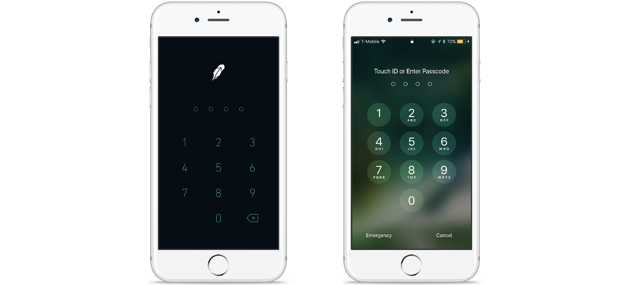
In the left example, blind users can only guess what they have to do here
- Instruction text should be to the left or above an input field, otherwise, it may only be discovered after the user has passed the input field. Developers can, however also choose a different reading order for the screen reader and read the instruction text first, even though it is below the input field in the UI.
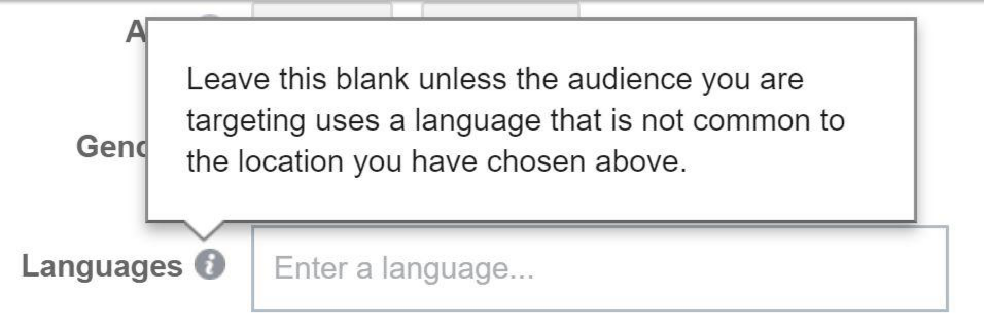
Example from Facebook, the instruction text is read right after the label “languages”
Labeling
Labeling all the elements will help your blind user understand what is on the screen. These labels are not visible to users who can see them; the screen reader only reads them. It’s the developer’s job to integrate them, but the designer should provide them when delivering the screens. Apple offers a few guidelines:
A label ideally consists of a single word, such as Add, Play, Delete, Search, Favorites, or Volume. Sometimes, however, it might be necessary to use a brief phrase to identify an element properly. When this is the case, create a very short phrase, such as “Play music,” “Add name,” or “Add to the event.”
A good label does not include the type of control or view. If you include the control type in an ‘Add button’ label, VoiceOver users would hear the “Add button button” every time they access that control. This might motivate users to stop using your application.
A label should begin with a capitalized word and doesn’t end with a period. All strings should be localized, including the accessibility attribute strings, so that the screen reader always speaks the user’s language
Labeling animated controls are especially important. For example, when a carousel (containing text) is used, you need to specify in the label that it is a carousel. Otherwise, the continuously changing text may confuse the user.
Next to using clear text and labels, there are other things you should take into account if you want to make sure blind users will get an optimal user experience:
Always provide a clearly indicated button or link to close a modal. In some apps, there are no such buttons or links, and users are supposed to close the modal by tapping/clicking outside of it, but blind users may experience this as an extra obstacle.
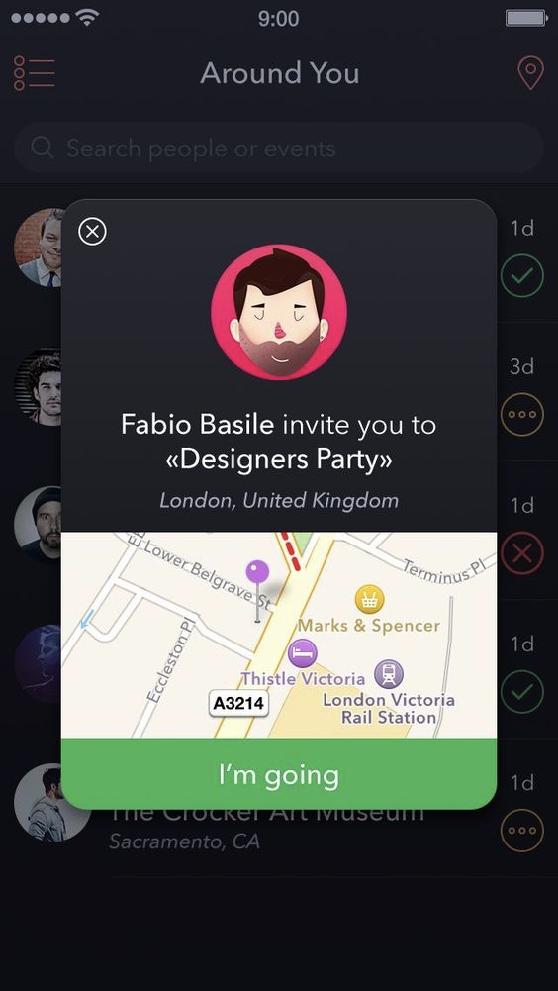
Example of a modal with a clear button to close it.
Be careful when using images! If an image has a functional value, e.g. icons that link to somewhere else, always add alt text that describes what the icon is for. Avoid using text in an image and if you do, make sure the text is also in the alt text.
Keep it simple! It may be tempting to use funny or creative text on your screen, but this is often very confusing for all users and even more so for the visually impaired.
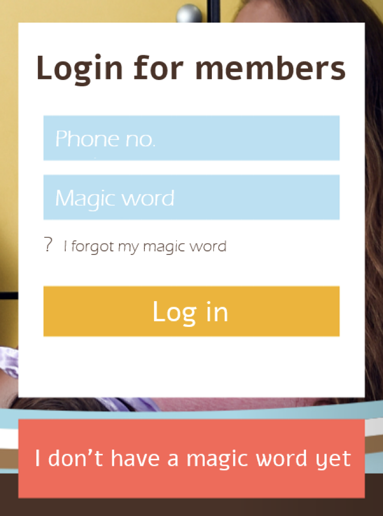
Example where the copy says “magic word” instead of simply “password”
Not only can designers make an effort to assist blind users, but developers can also implement tools to make their life easier:
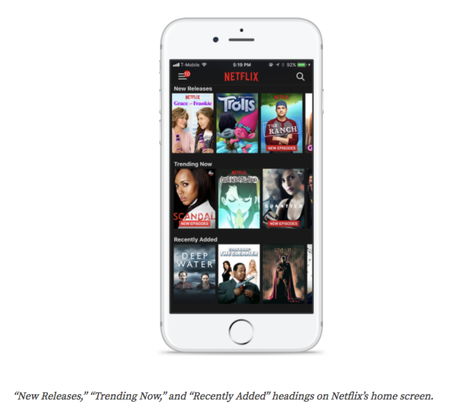
Make sure you use correct and clear naming in the code. Heading levels (H1, H2, etc) should provide an immediate insight into the hierarchy. Think, for instance, of Netflix using headers that allow users to jump from shelf to shelf without having to consult each shelf’s content.
Add identifiers ‘link’ or ‘button’ to indicate that an item is actionable. The screen reader will recognize these identifiers and read them to the user accordingly.
Ensure ease of navigation within the app, even when only using a keyboard: establish a correct flow when navigating with tab and arrow keys.
iOS offers the possibility to use accessibility hints. These allow you to provide extra information next to the label that is already on a button or link. When, for instance, a link is labeled with the title of a song, the accessibility hint can indicate ‘plays the song with this title. For Android, you can also provide an accessibility hint, but you will have to overwrite the standard action hint (tap, double tap, swipe,…)
Provide a label for loading states so users know that the app is loading. If there is no loading state label, users might think the app has crashed because they do not get any audio feedback anymore when they tap on the screen.
Use sounds to provide extra feedback when an action has finished successfully or has failed. Make sure that you use the standard alert sounds for things gone wrong, and success sounds for actions that have been completed successfully.
Last but not least, a tip to make sure you have taken everything into account: test your app with the screen reader on and your eyes closed. You will notice soon enough where a blind user can get stuck and where you need to provide additional assistance.
Need more practical tips? Got some interesting feedback? Don’t hesitate to get in touch!

