User experience of your daily frustrations: The password input field
Design
TL;DR: Masked input fields cause up to 78% of users to make typos during account creation, leading them to reset their passwords immediately. Standard fixes like double-typing or clicking a toggle icon add friction and clash with password managers. To solve this, icapps designers propose a focus-sensitive UX approach: the password stays visible while actively typing so users catch typos instantly, then automatically hides into dots the moment they click away (out-of-focus).
March 17, 2021
icapps
When you want to start using a new product or application, the first thing you’ll probably need to do is set up an account, and no account is created without picking a password. In most cases, the password field will automatically hide your new password, but if you’re very lucky you can take a look at it by clicking the eye icon. Although, most of the time you’ll just have to hope you didn’t make any mistakes. It’s like the blind leading the blind. Our UX designers gave this process some thought and came up with an idea to improve the password input field and as a logical consequence the registration setup process.
Why do so many of us have to click "forgot password" just seconds after making a brand-new account? The culprit is hidden text fields that mask our typos. While security is vital, the standard solutions, like typing a password twice or squinting at a tiny eye icon—often create more friction than they solve. Let's look at why standard password forms are broken, and explore a fresh, focus-sensitive UX approach that makes signing up faster, easier, and much less frustrating.
One password, a thousand variations
In some cases, and this happens far more than you might think, new users have to click the "forgot password button" the very first time they try to log into their newly created account. You’re probably laughing at this but I bet you’ll experience it at some point :) And here’s why; When you’re setting up your account you need to choose a password. This password will probably have to follow some requirements like: it has to contain one number, one capital letter, one special character, … So when you start typing the password you use for every single account, yes we know you still use that one password you created when you were 18, and you notice that it doesn’t match the requirements, the trouble begins. You thought you added an 8 at the end but you mistyped and it turned out to be a 9. You couldn't have noticed your mistake because the password is hidden. So the first time you log in, you can't seem to find the right password and have to click the “forgot password button”. Sounds familiar right? Did you know almost 78% of account users tend to experience this when logging in?
How do we keep making this mistake?
Passwords are almost always hidden when you need to enter them to set up your account. This is fixed in the DNA of the password field to protect your privacy. You don’t want people looking over your shoulder while you’re typing your dog’s name and birthday.But the implication is that when you don’t get to see what you’re typing, you won’t notice the mistakes you possibly made. When using a mobile phone, this is partially counteracted by briefly showing the letters you type.
At the moment there are two ways to counter this issue:
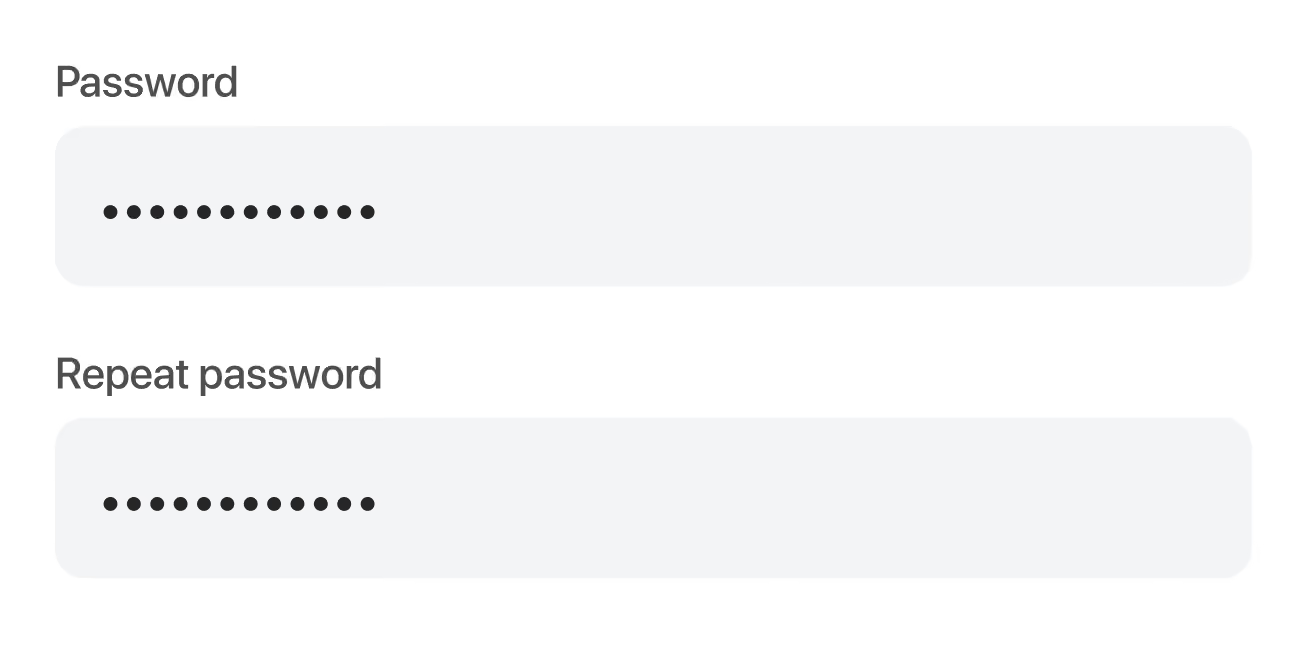
1. Enter your password twice
To avoid mistakes, some websites or applications make you enter your password twice when setting up your account. An algorithm checks if these passwords match and without a match, your account can’t be set up. This could be the perfect solution but for some people, it can be frustrating.
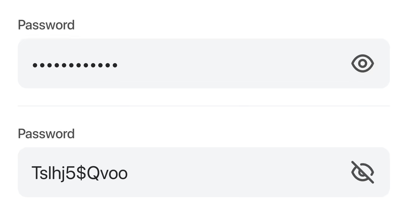
2. A show/hide button
Another option is to integrate a show/hide button in your password setup field. The eye icon we talked about. This button provides you with the ability to check the password you entered and to make sure you didn’t make a mistake. But to be completely honest, we’re not sure many people are using this. Plus, we noticed that this icon often conflicts with the standard pre-fill icon of Google and password managers like Lastpass and 1password. This makes it hard to click one of the icons, which discourages you to check your password. And we’ll have the same problem all over.
What if we turned the password input field all around?
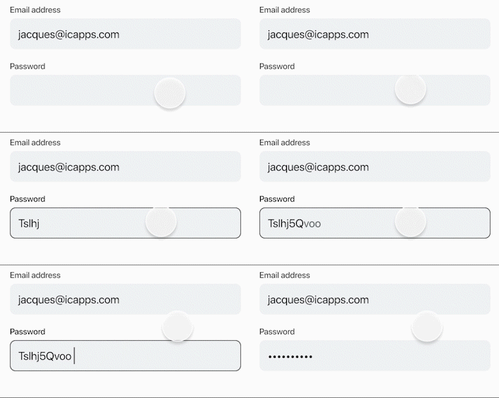
Our UX designers brainstormed about this topic and came up with an idea to solve this issue once and for all. What if we turned it all around? What if we made the password visible and gave you the option to hide it. Or even better, what if we made the password field focus-sensitive and hide the password when it is out-of-focus? Progressive, right?
Let’s have a look at the benefits of this idea:
You’ll have to implement only one password field, so no more double typing your password. Fill it in once, check it and you’re good to go. Creating an account will be easier and faster!
When the user can see what he’s typing, he can immediately correct a mistake. There is no need to double-check and the user doesn’t even need to take any action to see the password he or she entered.
Hiding the content when the password field is out-of-focus will ensure the security of your password and it will protect you from people looking over your shoulder.
By giving your users control over their password input, your sign-up form no longer suffers from a high correction or abandonment rate. This control gives people peace of mind and ensures better account setup satisfaction.
Although we’re kind of raving about this, we’re also very realistic about the possible hiccups.
Even though this is the best and most user-friendly solution, it does not alter that it’s not completely secure. We show the password when this particular field is in focus so there is a slight chance that wandering eyes can see it and take advantage of it. But this can also happen when you use the show/hide feature. Also, on mobile devices, you’re not completely sure because while typing the letters pop up, so attentive viewers can figure out your password as well.
But we’re convinced that when creating an account, ease of use is more important than safety because if you have some common sense, you won’t be creating your bank account on a crowded subway.
Now, let's put it to the test?
Now that we came to this idea, we can’t wait to test this in one of our next applications. We’ll definitely keep you posted about this process.
See what we did there? We took a very common issue, a daily frustration, juggled around with it, and came to an easy solution. We love to think outside the box, so if you're interested in a brainstorming session, we love to hear from you!