The future of digital
Discover the trends, tech, and strategic insights shaping tomorrow's digital landscape. Written by experts, curated for innovators.
.avif)
When Bluetooth devices compete: how we solve multi-device BLE challenges
The challenge most apps underestimate
Once the platform scaled, new needs emerged:
- Reliable location detection: To ensure users could always end their rides, even in GPS-poor environments like underground stations, we implemented Beacon technology as a vital fallback.
- Maintenance access: Service teams needed dedicated BLE access to battery locks for maintenance purposes.
Suddenly, the app wasn’t talking to one device anymore. It was juggling multiple Bluetooth interactions at the same time.
And that’s where things started to break.
One BLE radio, multiple demands
Smartphones only have one Bluetooth radio. Yet many apps treat it like an unlimited resource.
In practice, this leads to:
- Silent scan interruptions (especially on Android)
- Features interfering with each other
- Device-specific bugs that are hard to reproduce
- “Works most of the time” experiences that frustrate users
For platforms like Blue-bike, this directly impacts both user experience and operations. To solve this, we leveraged our partnership to build a robust architecture that treats Bluetooth as a shared system resource.
Our approach: treat BLE as a shared resource
At icapps, we’ve seen this pattern before across multiple projects. When apps evolve, Bluetooth complexity grows with them.
Instead of patching issues later, we design for it upfront.
The key insight is simple: Bluetooth should be managed like any shared system resource.
Meaning: just as a processor decides which app gets processing power, there needs to be a system that determines which function is allowed to use the Bluetooth antenna at any given moment. Without this central management, different parts of the app (such as unlocking the lock versus searching for beacons) will compete with each other for the connection, leading to failed actions and a frustrated user.
The solution: a scan coordinator
To prevent conflicts between BLE features, we implemented a centralized scan coordinator.
In short, it:
- Controls who can scan at any given time
- Assigns priorities (user actions over background processes)
- Temporarily pauses lower-priority scans
- Applies rate limiting to avoid OS restrictions
- Ensures consistent behavior across devices
This creates a predictable and stable Bluetooth layer, even as new features are added.
Why this matters for your product
If your app connects to just one device, you might never notice this problem.
But if you’re building:
- A connected product ecosystem
- A mobility or IoT platform
- A feature roadmap with future integrations
…this challenge will surface sooner or later.
And when it does, it won’t show up in testing. It will show up in production.
Designing for scale from day one
What we built for Blue-bike is not a workaround. It’s a scalable foundation.
By centralizing BLE coordination:
- User interactions become reliable
- Background processes stay invisible but effective
- New integrations don’t introduce new risks
Most importantly, it allows teams to keep innovating without breaking existing functionality.
What this says about how we work
This project reflects how we approach digital products at icapps.
We don’t just build what’s needed today.
We anticipate what your product will need tomorrow.
Because in connected ecosystems, small technical decisions can have a big impact on user experience.
If you’re working on a product with Bluetooth, IoT or multiple device integrations, it’s worth asking: Are we building for today’s use case… or tomorrow’s complexity?
FAQ: Bluetooth and multi-device BLE
What is multi-device BLE?
It refers to apps interacting with multiple Bluetooth Low Energy devices, common in IoT, mobility, and connected products.
Why does Bluetooth fail with multiple devices?
Because smartphones only have one BLE radio. Multiple scans or connections can interfere, causing unreliable behavior.
How do you manage multiple BLE interactions?
By using a centralized approach, like a scan coordinator, to control access, prioritize actions, and prevent conflicts.
What are common BLE issues in mobile apps?
Unstable connections, background limitations, Android restrictions, and conflicts between multiple Bluetooth processes.
When do you need a scan coordinator?
As soon as your app connects to multiple devices or combines background and foreground BLE features
All insights

User experience of your daily frustrations: The password input field
Why do so many of us have to click "forgot password" just seconds after making a brand-new account? The culprit is hidden text fields that mask our typos. While security is vital, the standard solutions, like typing a password twice or squinting at a tiny eye icon—often create more friction than they solve. Let's look at why standard password forms are broken, and explore a fresh, focus-sensitive UX approach that makes signing up faster, easier, and much less frustrating.
One password, a thousand variations
In some cases, and this happens far more than you might think, new users have to click the "forgot password button" the very first time they try to log into their newly created account. You’re probably laughing at this but I bet you’ll experience it at some point :) And here’s why; When you’re setting up your account you need to choose a password. This password will probably have to follow some requirements like: it has to contain one number, one capital letter, one special character, … So when you start typing the password you use for every single account, yes we know you still use that one password you created when you were 18, and you notice that it doesn’t match the requirements, the trouble begins. You thought you added an 8 at the end but you mistyped and it turned out to be a 9. You couldn't have noticed your mistake because the password is hidden. So the first time you log in, you can't seem to find the right password and have to click the “forgot password button”. Sounds familiar right? Did you know almost 78% of account users tend to experience this when logging in?
How do we keep making this mistake?
Passwords are almost always hidden when you need to enter them to set up your account. This is fixed in the DNA of the password field to protect your privacy. You don’t want people looking over your shoulder while you’re typing your dog’s name and birthday. But the implication is that when you don’t get to see what you’re typing, you won’t notice the mistakes you possibly made. When using a mobile phone, this is partially counteracted by briefly showing the letters you type.
At the moment there are two ways to counter this issue:
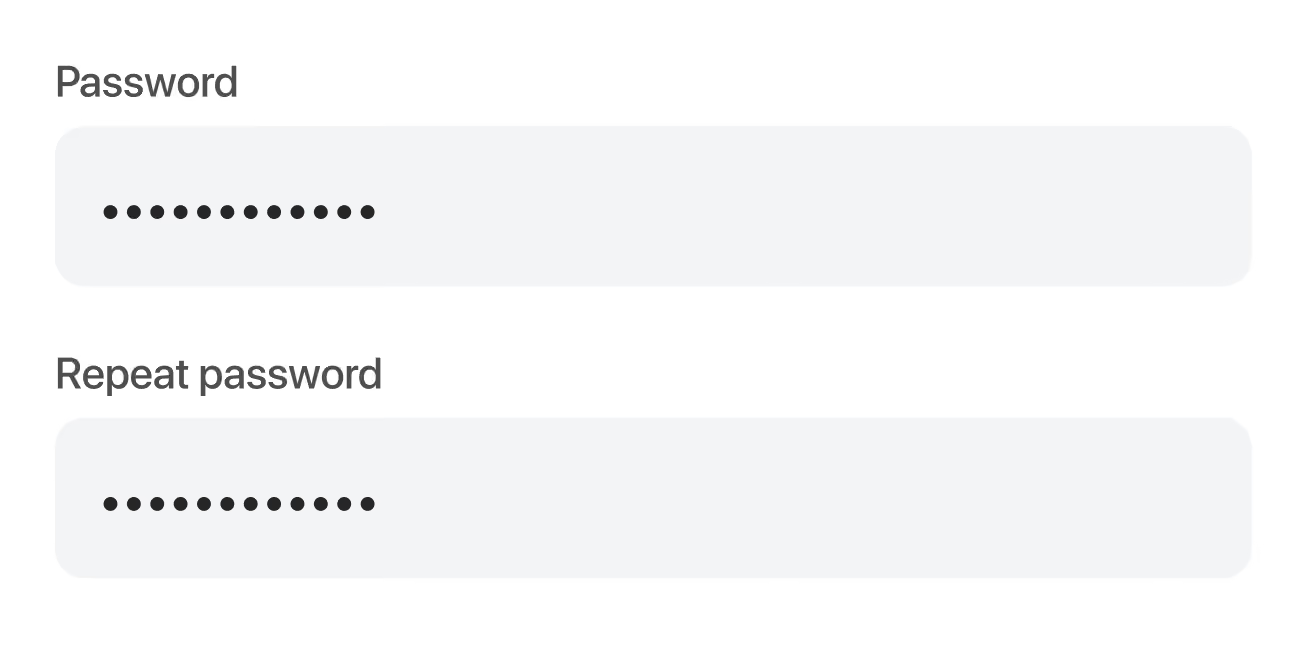
1. Enter your password twice
To avoid mistakes, some websites or applications make you enter your password twice when setting up your account. An algorithm checks if these passwords match and without a match, your account can’t be set up. This could be the perfect solution but for some people, it can be frustrating.
2. A show/hide button
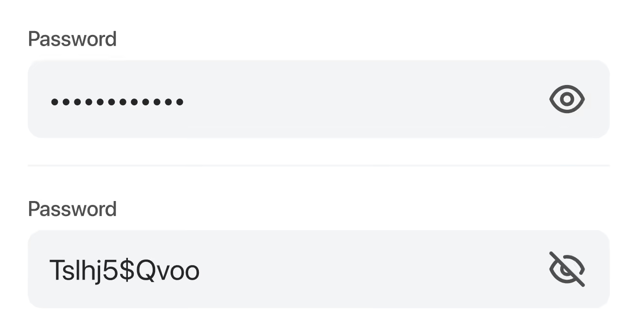
Another option is to integrate a show/hide button in your password setup field. The eye icon we talked about. This button provides you with the ability to check the password you entered and to make sure you didn’t make a mistake. But to be completely honest, we’re not sure many people are using this. Plus, we noticed that this icon often conflicts with the standard pre-fill icon of Google and password managers like Lastpass and 1password. This makes it hard to click one of the icons, which discourages you to check your password. And we’ll have the same problem all over.
What if we turned the password input field all around?
Our UX designers brainstormed about this topic and came up with an idea to solve this issue once and for all. What if we turned it all around? What if we made the password visible and gave you the option to hide it. Or even better, what if we made the password field focus-sensitive and hide the password when it is out-of-focus? Progressive, right?
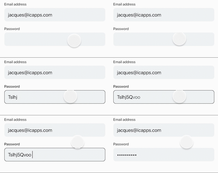
Let’s have a look at the benefits of this idea:
- You’ll have to implement only one password field, so no more double typing your password. Fill it in once, check it and you’re good to go. Creating an account will be easier and faster!
- When the user can see what he’s typing, he can immediately correct a mistake. There is no need to double-check and the user doesn’t even need to take any action to see the password he or she entered.
- Hiding the content when the password field is out-of-focus will ensure the security of your password and it will protect you from people looking over your shoulder.
- By giving your users control over their password input, your sign-up form no longer suffers from a high correction or abandonment rate. This control gives people peace of mind and ensures better account setup satisfaction.
Although we’re kind of raving about this, we’re also very realistic about the possible hiccups.
Even though this is the best and most user-friendly solution, it does not alter that it’s not completely secure. We show the password when this particular field is in focus so there is a slight chance that wandering eyes can see it and take advantage of it. But this can also happen when you use the show/hide feature. Also, on mobile devices, you’re not completely sure because while typing the letters pop up, so attentive viewers can figure out your password as well.
But we’re convinced that when creating an account, ease of use is more important than safety because if you have some common sense, you won’t be creating your bank account on a crowded subway.
Now, let's put it to the test?
Now that we came to this idea, we can’t wait to test this in one of our next applications. We’ll definitely keep you posted about this process.
In the meantime, take a look at our other blogs about design
See what we did there? We took a very common issue, a daily frustration, juggled around with it, and came to an easy solution. We love to think outside the box, so if you're interested in a brainstorming session, we love to hear from you!
Clarity to your digital challenge?
Whether you’re modernising a complex IT landscape or building a digital product that must scale and last, it always starts with the right conversation.