What types of buttons are there?
Buttons are clickable elements used to trigger actions. They call the user to action and allow users to interact with pages differently. Within a product, some actions are more important than others and therefore are given more or less importance/appearance in the User Interface (UI). To consistently use the right button within a Design System, buttons are renamed based on their importance so that each designer/developer can use the right one and communication is clear within the team.
Why still use "Primary", "Secondary" and "Tertiary"?
This naming scheme is ingrained in the design and development world, even though it seems impossible to trace its origins. Depending on the objective, more or less emphasis is put on the action, and consequently, a hierarchy is created from most important to less important: primary → secondary → tertiary. In essence, this is meaningless and is defined by the system used. In the case of the primary button, it could be:
Is the primary button the most used one? (= the most logical action you would do on a page)
Is the primary button the one that visually stands out the most?
Or is the primary button used to display the most important action within a context (and thus can appear multiple times on 1 page)
When setting up a design system for a redesign, our designers arrived at the following scale to sort actions by importance: primary first, secondary comes next, and so on:
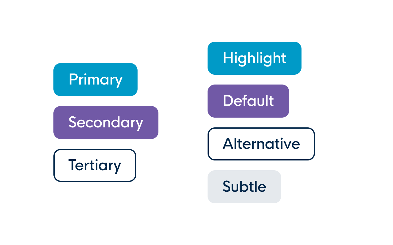
- Primary button: the most important button on a page that occurs only once
- Secondary button: used for most actions on the page (= the everyday actions or the second-most-important actions). Secondary outline button: used for less important actions on the page (mostly in a button group with the primary and secondary buttons).
- Tertiary button: button with very little focus (in most cases, just a button label with no outline or fill color, making it look more like a link (without an underline)).
Semantic button naming to the rescue
To tackle this problem, our designers have changed the naming scheme to a semantic approach: instead of describing the hierarchy of the button, they now describe what the button is meant for, so the naming is no longer meaningless. This makes it immediately clear how the button should be used without changing the look and feel of the buttons.
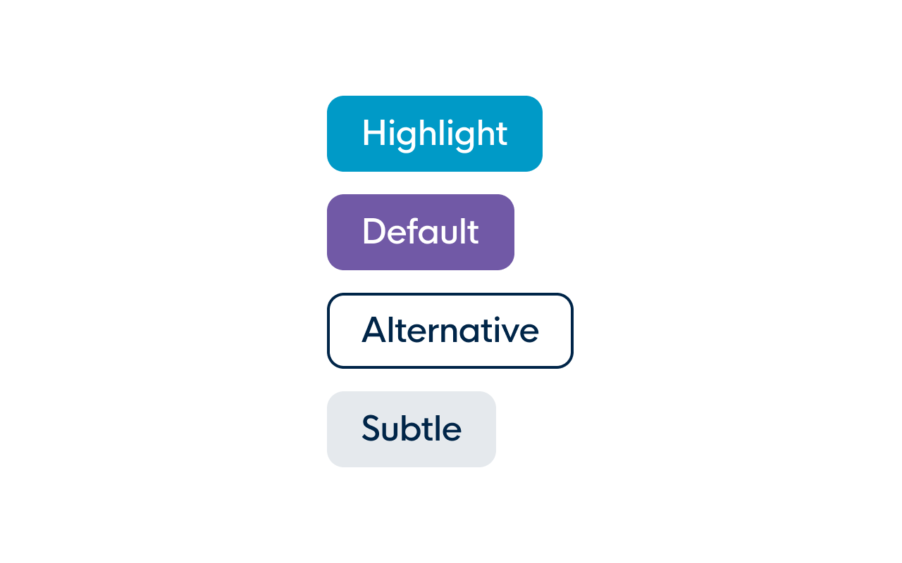
- Primary → Highlight: a button that puts you in the spotlight and is, therefore, the most important of your page (occurs only once per page)
- Secondary → Default: the most used button within the UI and the one you use first
Secondary outline → Alternative: a button used to offer an alternative to the default button(s) - Tertiary → Subtle: a subtle button that is not immediately noticeable in the UI but still draws enough attention for the user to find his way around.
Naming buttons is hard! Documentation is key.
Good documentation (and communication) are indispensable for a design system. Unfortunately, in practice, it turns out that this is not sufficient for several reasons: users having different experiences and ideas about components that do not match the documentation, communication getting lost between different teams, or not being able to find the way to the (correct) documentation. Therefore, it is equally important to think through the naming of the components to ensure consistent usage. Often it is sufficient to apply a standard naming convention (e.g. avatar, badge, checkbox, pagination, ...). In other cases, it is best to take the time to think carefully about how best to describe a component. Write down a number of proposals and present them to the main stakeholders to come to a conclusion that works best for you.
In our case, the new naming scheme eliminated all confusion for current users. But also for new users of the design system, everything was clear to apply the buttons correctly from the first designs on!