The future of digital
Discover the trends, tech, and strategic insights shaping tomorrow's digital landscape. Written by experts, curated for innovators.
.avif)
When Bluetooth devices compete: how we solve multi-device BLE challenges
The challenge most apps underestimate
Once the platform scaled, new needs emerged:
- Reliable location detection: To ensure users could always end their rides, even in GPS-poor environments like underground stations, we implemented Beacon technology as a vital fallback.
- Maintenance access: Service teams needed dedicated BLE access to battery locks for maintenance purposes.
Suddenly, the app wasn’t talking to one device anymore. It was juggling multiple Bluetooth interactions at the same time.
And that’s where things started to break.
One BLE radio, multiple demands
Smartphones only have one Bluetooth radio. Yet many apps treat it like an unlimited resource.
In practice, this leads to:
- Silent scan interruptions (especially on Android)
- Features interfering with each other
- Device-specific bugs that are hard to reproduce
- “Works most of the time” experiences that frustrate users
For platforms like Blue-bike, this directly impacts both user experience and operations. To solve this, we leveraged our partnership to build a robust architecture that treats Bluetooth as a shared system resource.
Our approach: treat BLE as a shared resource
At icapps, we’ve seen this pattern before across multiple projects. When apps evolve, Bluetooth complexity grows with them.
Instead of patching issues later, we design for it upfront.
The key insight is simple: Bluetooth should be managed like any shared system resource.
Meaning: just as a processor decides which app gets processing power, there needs to be a system that determines which function is allowed to use the Bluetooth antenna at any given moment. Without this central management, different parts of the app (such as unlocking the lock versus searching for beacons) will compete with each other for the connection, leading to failed actions and a frustrated user.
The solution: a scan coordinator
To prevent conflicts between BLE features, we implemented a centralized scan coordinator.
In short, it:
- Controls who can scan at any given time
- Assigns priorities (user actions over background processes)
- Temporarily pauses lower-priority scans
- Applies rate limiting to avoid OS restrictions
- Ensures consistent behavior across devices
This creates a predictable and stable Bluetooth layer, even as new features are added.
Why this matters for your product
If your app connects to just one device, you might never notice this problem.
But if you’re building:
- A connected product ecosystem
- A mobility or IoT platform
- A feature roadmap with future integrations
…this challenge will surface sooner or later.
And when it does, it won’t show up in testing. It will show up in production.
Designing for scale from day one
What we built for Blue-bike is not a workaround. It’s a scalable foundation.
By centralizing BLE coordination:
- User interactions become reliable
- Background processes stay invisible but effective
- New integrations don’t introduce new risks
Most importantly, it allows teams to keep innovating without breaking existing functionality.
What this says about how we work
This project reflects how we approach digital products at icapps.
We don’t just build what’s needed today.
We anticipate what your product will need tomorrow.
Because in connected ecosystems, small technical decisions can have a big impact on user experience.
If you’re working on a product with Bluetooth, IoT or multiple device integrations, it’s worth asking: Are we building for today’s use case… or tomorrow’s complexity?
FAQ: Bluetooth and multi-device BLE
What is multi-device BLE?
It refers to apps interacting with multiple Bluetooth Low Energy devices, common in IoT, mobility, and connected products.
Why does Bluetooth fail with multiple devices?
Because smartphones only have one BLE radio. Multiple scans or connections can interfere, causing unreliable behavior.
How do you manage multiple BLE interactions?
By using a centralized approach, like a scan coordinator, to control access, prioritize actions, and prevent conflicts.
What are common BLE issues in mobile apps?
Unstable connections, background limitations, Android restrictions, and conflicts between multiple Bluetooth processes.
When do you need a scan coordinator?
As soon as your app connects to multiple devices or combines background and foreground BLE features
All insights

icapps is now officially ISO 27001 certified
What does an ISO 27001 certificate entail?
An ISO certificate is more than a badge. It’s official proof that an organization operates according to internationally recognised standards. ISO 27001 specifically focuses on information security, ensuring that data is handled responsibly, securely, and consistently across every process.
Unlike common perception, it isn’t just about firewalls, passwords, or encryption. It’s about people, processes, and accountability. It ensures that information security is integrated into every layer of our organization, from HR and finance to software design and client delivery. It’s about embedding security into the way we think and work.
As cyberattacks become a daily headline, they remind us how fragile digital ecosystems can be: data leaks, ransomware, systems brought to a halt. Meanwhile, regulations like the NIS2 directive are tightening across industries, making robust information security a requirement.For icapps, this certification confirms that information security is built into our DNA and into every digital product from day one.
Security in every layer
At icapps we’ve mapped out every process that could affect information security. Throughout this journey, security stopped being “someone’s responsibility” and became everyone’s mindset.
It starts internally with clear policies, structured processes, and shared responsibility. We are certified across our full operational scope, meaning that every process within our organization, from HR and finance to design, engineering, and project delivery, adheres to the ISO 27001 standards. Take our joiner-mover-leaver process: when someone joins the team, they receive access only to the systems and data relevant to their role. When responsibilities change, so do access rights. And when someone leaves, all permissions are revoked immediately. It’s a simple principle that prevents small oversights from becoming big vulnerabilities.
That same thinking flows into our projects. From the very first design phase, we ask:
- What kind of data will this platform process?
- Where will that data live?
- What safeguards are needed to protect it?
Our CI/CD pipelines automatically perform security checks, dependency scans, and code analyses to catch vulnerabilities early. Every product we build adheres to OWASP ASVS standards, which define best practices for secure application development.
This way, every release meets the same high standards for performance and protection.
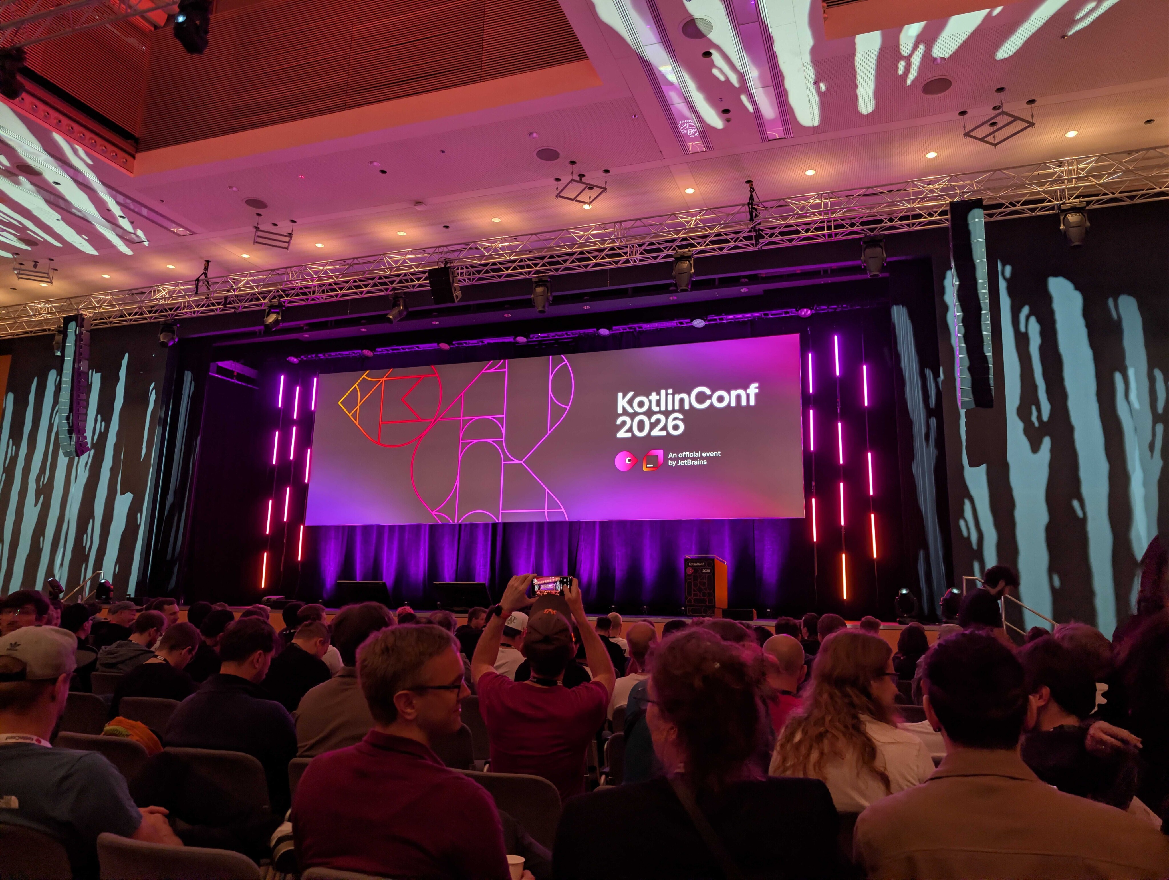
Key insights from KotlinConf '26
The numbers & corporate adoption
- Market Dominance: Kotlin is used in 92% of Play Store apps, and 86% of Android devs call it their primary language.
- KMP Growth: The number of KMP apps in stores doubled over the past year, supported by 3,600+ ready-to-use libraries on klibs.io.
- Enterprise Trust: Google Docs has been completely rewritten in KMP as part of a full Google Workspace migration, and Google Search is largely converted to Kotlin. Sony also demonstrated successful, phased KMP adoption in complex setups.
Tooling & performance gains
Kotlin 2.4 has officially gone stable, bringing core features like context parameters and explicit backing fields into production setups. The tooling updates focus heavily on optimizing performance and widening the ecosystem:
- iOS & Build performance: Moving from Kotlin 2.2 to 2.4 yields a 25% reduction in build times and a 58% decrease in build RAM usage. Swift Export (now supporting suspend functions and Flows) and Swift Package Manager (SPM) integration have both successfully reached Alpha. Additionally, Liquid Glass UI-interop allows native components to blend seamlessly with Compose UI.
- New Ecosystem tooling: A new uniform Kotlin CLI, a streamlined project structure for production applications, and an Alpha VS Code extension are expanding Kotlin's footprint far outside traditional IDE boundaries.
Android is officially "Compose-first"
Google has officially declared Android Compose-first, shifting traditional Views to maintenance mode. Writing a native app in Compose today ensures a much easier port to Compose Multiplatform (CMP) later since the UI layer is already portable. On the multiplatform side, Navigation 3 is now stable, CMP for Web is in Beta (with accessibility and HTML interop), and Hot Reload for Desktop is stable by default.
How the Ecosystem validates the icapps workflow
The announcements from KotlinConf '26 didn't catch us off guard; rather, they heavily validate our long-term roadmap and internal standards.
We were already compose-first
While the broader industry is currently adjusting to Google's massive push toward Jetpack Compose and KMP, Compose-first has been our internal standard for years. A prime example is our work for Bolero.
By minimizing our legacy XML footprint early on, our architecture is already optimized for modern development. For our partners, this mature foundation means any future transition to KMP or CMP will be significantly faster, cleaner, and more cost-effective. To capitalize on this, we are executing immediate action items to phase out our remaining legacy XML Views and test how Android’s new CLI can augment our automated testing.
Navigating the AI Shift: SDD and EDD
With JetBrains shaping future AI tooling via the open Agent Client Protocol (ACP), software engineering is actively shifting away from manual coding toward two new structural paradigms:
- Spec-Driven Development (SDD): Writing highly precise technical specifications beforehand to act as a contract and regression check for AI agents.
- Eval-Driven Development (EDD): Setting up rigorous evaluation guardrails (such as "AI as a judge") to actively combat hallucinations and context drift.
Moving forward, we will actively investigate how to integrate these key insights and guardrails into our own AI SDLC workflow to broaden its power even further.
While we are experimenting with the new Android CLI and Journeys to see how automated agents can safely speed up routine testing, we are balancing this with a healthy note of caution. Conference leaders highlighted critical industry nuances, including ethical concerns, potential senior burnout from a shrinking junior pipeline, and impending pricing "rugpulls" as VC-subsidized AI tools inevitably shift to heavy usage-based billing. Our focus remains on using AI to augment, not replace, our strict quality standards.
The bottom line: What it means for you
- For Mobile Developers: The shift is absolute. Android is officially Compose-first, and KMP is rapidly narrowing the iOS gap with 25% faster builds and smoother Swift integration.
- For Tech Leads & CTOs: KMP is enterprise-proven. With Google migrating Workspace and Search to Kotlin, KMP has graduated from an experimental framework to a risk-reduced strategy for scalable architecture.
- For icapps clients: While we work purely native today, we are closely monitoring these advancements. We stand ready to adopt KMP and Compose Multiplatform (CMP) the moment the timing is right for your business.
When Bluetooth devices compete: how we solve multi-device BLE challenges
The challenge most apps underestimate
Once the platform scaled, new needs emerged:
- Reliable location detection: To ensure users could always end their rides, even in GPS-poor environments like underground stations, we implemented Beacon technology as a vital fallback.
- Maintenance access: Service teams needed dedicated BLE access to battery locks for maintenance purposes.
Suddenly, the app wasn’t talking to one device anymore. It was juggling multiple Bluetooth interactions at the same time.
And that’s where things started to break.
One BLE radio, multiple demands
Smartphones only have one Bluetooth radio. Yet many apps treat it like an unlimited resource.
In practice, this leads to:
- Silent scan interruptions (especially on Android)
- Features interfering with each other
- Device-specific bugs that are hard to reproduce
- “Works most of the time” experiences that frustrate users
For platforms like Blue-bike, this directly impacts both user experience and operations. To solve this, we leveraged our partnership to build a robust architecture that treats Bluetooth as a shared system resource.
Our approach: treat BLE as a shared resource
At icapps, we’ve seen this pattern before across multiple projects. When apps evolve, Bluetooth complexity grows with them.
Instead of patching issues later, we design for it upfront.
The key insight is simple: Bluetooth should be managed like any shared system resource.
Meaning: just as a processor decides which app gets processing power, there needs to be a system that determines which function is allowed to use the Bluetooth antenna at any given moment. Without this central management, different parts of the app (such as unlocking the lock versus searching for beacons) will compete with each other for the connection, leading to failed actions and a frustrated user.
The solution: a scan coordinator
To prevent conflicts between BLE features, we implemented a centralized scan coordinator.
In short, it:
- Controls who can scan at any given time
- Assigns priorities (user actions over background processes)
- Temporarily pauses lower-priority scans
- Applies rate limiting to avoid OS restrictions
- Ensures consistent behavior across devices
This creates a predictable and stable Bluetooth layer, even as new features are added.
Why this matters for your product
If your app connects to just one device, you might never notice this problem.
But if you’re building:
- A connected product ecosystem
- A mobility or IoT platform
- A feature roadmap with future integrations
…this challenge will surface sooner or later.
And when it does, it won’t show up in testing. It will show up in production.
Designing for scale from day one
What we built for Blue-bike is not a workaround. It’s a scalable foundation.
By centralizing BLE coordination:
- User interactions become reliable
- Background processes stay invisible but effective
- New integrations don’t introduce new risks
Most importantly, it allows teams to keep innovating without breaking existing functionality.
What this says about how we work
This project reflects how we approach digital products at icapps.
We don’t just build what’s needed today.
We anticipate what your product will need tomorrow.
Because in connected ecosystems, small technical decisions can have a big impact on user experience.
If you’re working on a product with Bluetooth, IoT or multiple device integrations, it’s worth asking: Are we building for today’s use case… or tomorrow’s complexity?
FAQ: Bluetooth and multi-device BLE
What is multi-device BLE?
It refers to apps interacting with multiple Bluetooth Low Energy devices, common in IoT, mobility, and connected products.
Why does Bluetooth fail with multiple devices?
Because smartphones only have one BLE radio. Multiple scans or connections can interfere, causing unreliable behavior.
How do you manage multiple BLE interactions?
By using a centralized approach, like a scan coordinator, to control access, prioritize actions, and prevent conflicts.
What are common BLE issues in mobile apps?
Unstable connections, background limitations, Android restrictions, and conflicts between multiple Bluetooth processes.
When do you need a scan coordinator?
As soon as your app connects to multiple devices or combines background and foreground BLE features

Sander Hofman becomes managing partner at icapps
You’ve been Head of Technology at icapps for a year now. What have you learned over the past year?
“Quite a lot (laughs). When I started, I was eager to accelerate everything, processes, tooling, technology… But I quickly realized that you can’t speed up without a solid foundation. Over the past few years, our rapid growth meant that we had, unconsciously, overlooked basic processes like standards, testing, deployments, and even our own IT infrastructure.
So my first year was really about deliberately slowing down, sitting with people, listening, and rethinking the way we work. It might not sound flashy, but the results speak for themselves. Today, we have a clear understanding of how we work, where bottlenecks are, and how we can improve. And that prepares us to move forward faster.”
At icapps, technology is never a gamble. What does that really mean?
“It means we don’t chase hype. Everything starts with understanding the business needs. What is the customer trying to achieve, what works already, what doesn’t, and what fits their specific context? We have a proven technology stack, but we always adapt it to the client’s reality, based on our collective expertise.
Of course, we explore new technologies constantly, but we adopt them only when they truly add value. We don’t just ‘do something with AI’ because everyone else is. Our clients need to benefit today and in the long term. Striking that balance is our responsibility as a technology partner, and it’s exactly why our clients trust us.”
“You can’t keep building on a shaky foundation” – what’s the biggest misconception about innovation?
“That it needs to be flashy, big, or special. Real innovation is often invisible. Take a recent project in the Port of Antwerp, for example. We implemented speech-to-text so dockworkers don’t have to type orders on a tablet, they can keep working with gloves on. That’s innovation. It might not look spectacular, but it delivers huge efficiency gains. Innovation should be smart, not loud.”
How do we turn that into tangible impact for our clients?
“By diving deep into their processes and business architecture, not by immediately jumping into technology. For every client, we start with: what goals need to be achieved, what processes currently support them, and where are the pain points? From there, we translate insights into clear Quality Attributes. These become the foundation for future solutions and guide our technology decisions. That way, quality is based not on gut feeling but measurable criteria linked directly to the client’s objectives.”

How do we help clients distinguish what works from what’s just hype?
“By being critical. If a client says, ‘we want to do something with AI,’ our first question is always: why? What should it achieve? Technology only makes sense in the right context. If a client is still struggling with basic processes, AI won’t magically fix it. We often play devil’s advocate, not to be difficult, but to ensure sustainable impact.”
Is security a brake or an accelerator?
“Undoubtedly an accelerator, but only if it’s integrated from day one. Not as a checklist afterward, but as a structural part of design, delivery, and monitoring. Our ISO 27001 certification confirms that we work according to international information security standards. That builds trust, both internally and with clients.”
icapps is also heavily invested in application modernization. Why?
“Many companies still rely on legacy systems that slow down growth. You can’t keep building on a shaky foundation. Modernization isn’t just rewriting old code; it’s about rethinking the entire digital ecosystem, data flows, integrations, security, consistent UX across touchpoints… Yes, it’s complex, but that’s exactly where we excel. We combine modern architecture with strong engineering standards and a multidisciplinary team capable of bridging different domains. We’re doubling down on this next year because it’s a challenge we truly love tackling.”
Where else will you strategically focus in the coming years?
“In tech, companies usually sit at extremes: hyper-creative and disruptive, or robust and delivery-focused. We consciously choose the middle path, we combine innovation and design with engineering excellence and strong governance. We build digital platforms that are user-friendly, scalable, and demonstrably impactful. In the past, our hybrid nature seemed like a disadvantage. Today, it’s our strength, and that’s what we want to emphasize more in the coming years, because sustainable impact comes from that sweet spot in the center.”
Clarity to your digital challenge?
Whether you’re modernising a complex IT landscape or building a digital product that must scale and last, it always starts with the right conversation.