Fifteen years ago, we kind of made history (😉) by designing and developing Belgium's first app for the App Store. Today, we symbolically continue that spirit by designing a Solo Open Kitchen app for the Apple Vision Pro. And, of course, we wanted to share our insights and best practices from this journey with you, offering a glimpse into the future of augmented reality (AR) with VisionOS.
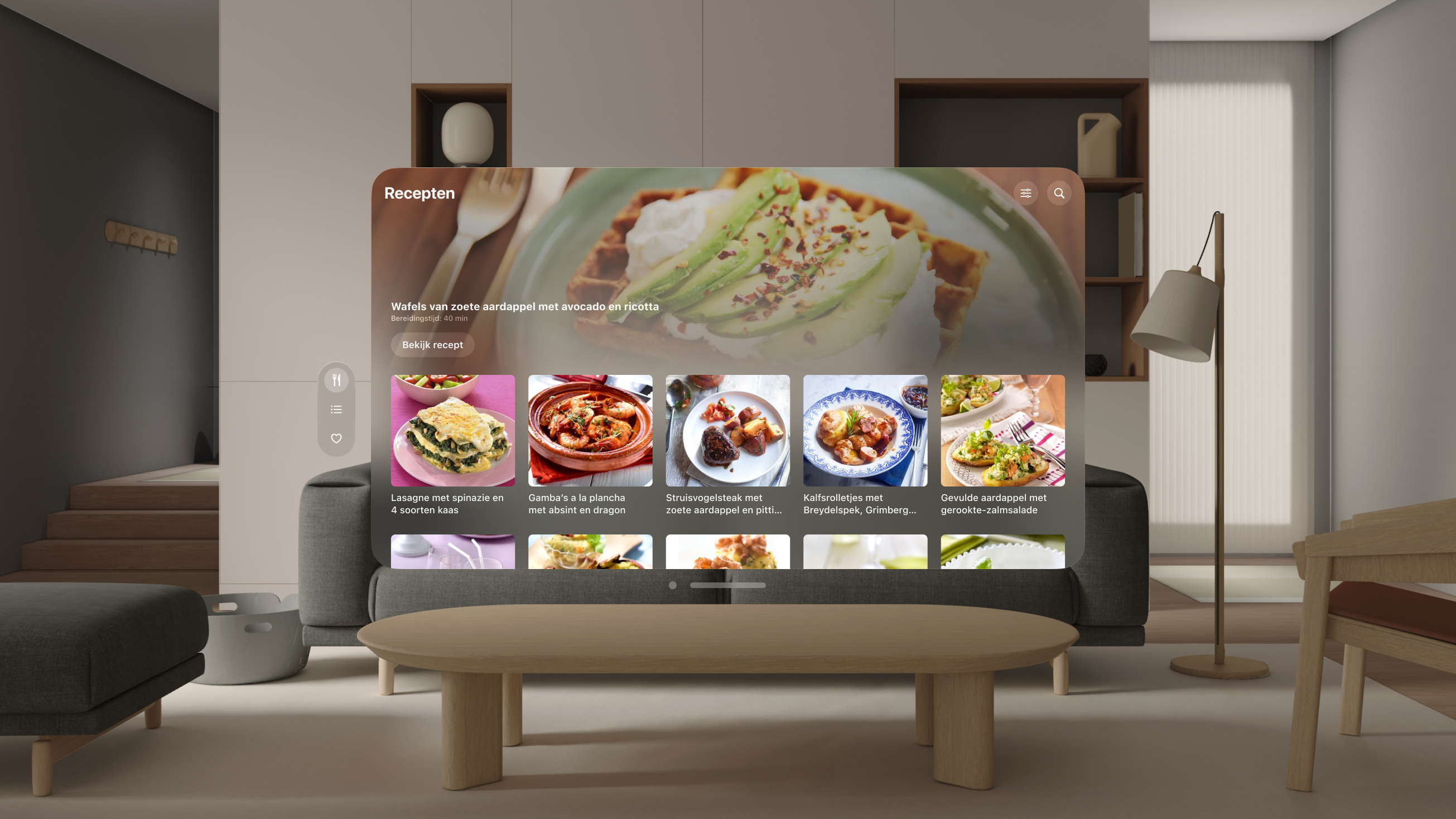
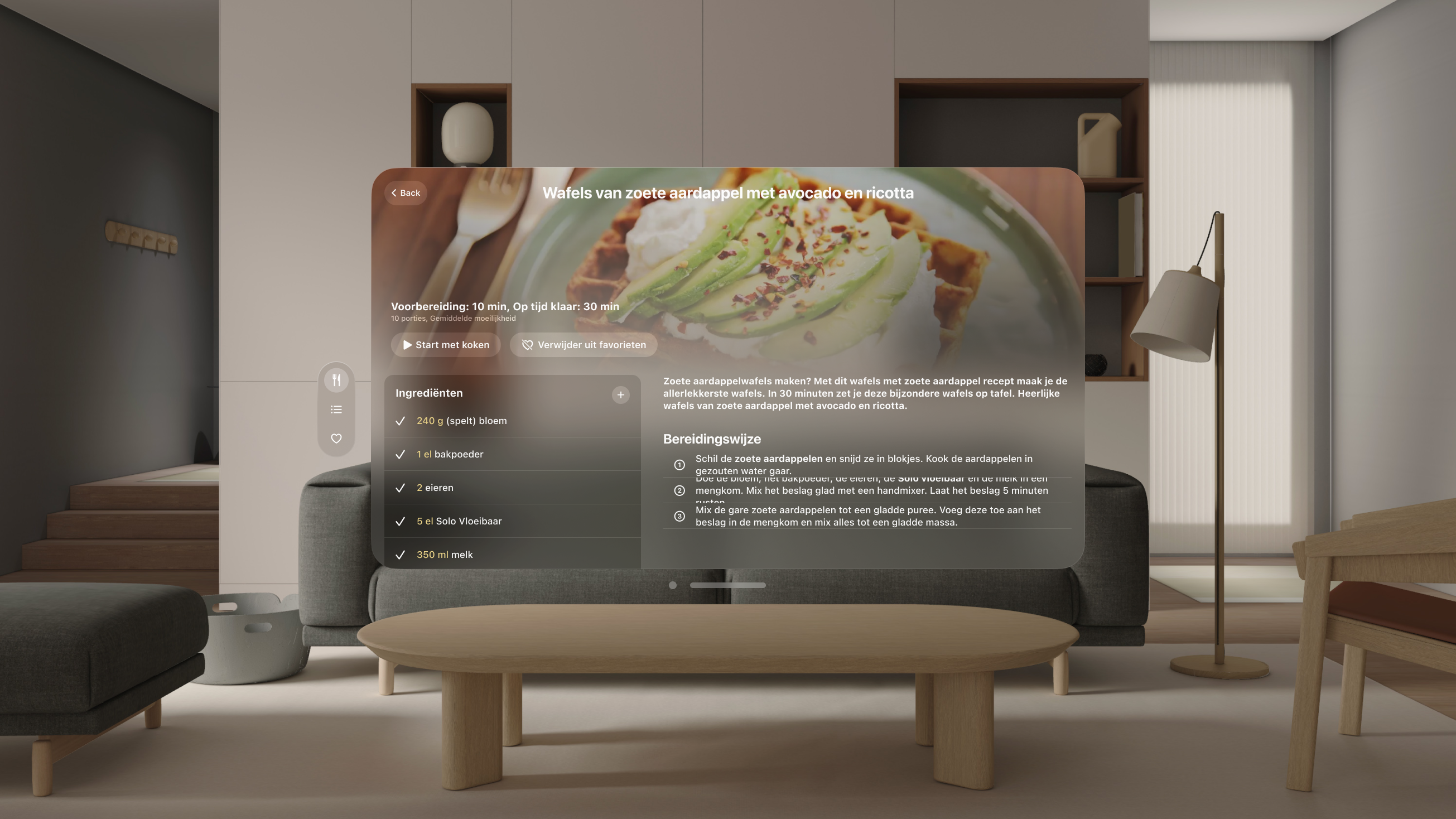
For the Solo Open Kitchen app, our goal was to shake up the cooking experience by integrating AR elements that make it more interactive and engaging. We built a kitchen assistant that not only guides you through recipes but also brings them to life right in your kitchen. With VisionOS, we utilized glass morphism to create translucent windows that display recipe steps, timers, and ingredient lists in a visually appealing manner. These windows can be anchored to specific locations in your kitchen, like placing a timer next to your stove or recipe instructions on your counter, enhancing both functionality and immersion.
Read on!
The return of glass morphism
The window design
VisionOS reintroduces the elegant "glass morphism" design, giving windows a unique, glass-like appearance. This design choice is not just about aesthetics; it plays a critical role in user experience by allowing users to glimpse underlying elements, creating a layered and visually engaging interface. In the Solo app, the translucent quality of windows helps users keep track of their kitchen activities while interacting with the app, blending functionality with an engaging visual experience.
A key element in this design is the placement of external controls, such as the tab bar and toolbar, outside the window itself. This maximizes the available space within the window for content, ensuring a clean and spacious interface. Moreover, dynamic sizing is crucial. While multiple windows are supported, focusing on a single, adaptable window enhances usability, allowing users to immerse themselves fully in their tasks without distraction.
Human-centered design principles
Apple's VisionOS reflects a deep commitment to human-centered design, emphasizing user comfort and engagement. Designing for landscape orientations, for instance, acknowledges that users find it more natural to move their heads left and right rather than up and down. This ergonomic consideration is vital for creating a comfortable and intuitive user experience.
Anchored windows are another essential aspect. By anchoring windows to the physical space rather than the user, we create a more stable and immersive experience. In the Solo app, this means placing timers next to the stove or recipe steps on the kitchen counter, making these tools feel like a natural extension of the kitchen environment.
The screen size also plays a significant role in evoking specific emotions. Smaller screens can create a sense of intimacy, while larger screens offer a more immersive and impressive experience. In the Solo app, balancing these elements helps create a kitchen assistant that feels both personal and expansive.
Enhancing immersion
To guide user focus and enhance immersion, consider the following:
Subtle animations: Use subtle animations to direct attention and indicate interactions without overwhelming the user.
Spatial audio: Incorporate spatial audio to create a more immersive environment. Sounds that appear to originate from specific directions can enhance the overall experience.
Light and shadow: Use light and shadow to add depth to your app. Elements should emit light and cast shadows to create a realistic 3D environment.
UI foundations
Creating a coherent and accessible user interface is essential for VisionOS apps. The interface must integrate seamlessly into the VisionOS ecosystem, utilizing all Apple-provided components correctly and optimally. Additionally, it must prioritize readability and usability to ensure the best possible experience in augmented reality (AR).
A coherent and accessible user interface is essential for VisionOS apps. The interface must integrate seamlessly into the VisionOS ecosystem while prioritizing readability and usability. For the Solo app, we focused on creating layered app icons to align with VisionOS's design standards, breaking them into backgrounds, visual accents, and wordmarks.
Material choices: Avoid opaque windows and use contrasting materials for different window sections. This helps distinguish different parts of your app while maintaining accessibility.
Heavier fonts: For better readability, use a heavier font-weight. Regular text should be upgraded to medium, and semi-bold text should become bold.
White text and color fill: To ensure clarity, use white text on darker backgrounds and reserve colors for fills rather than text.
Focus feedback: Indicate focus by visually brightening the focused element, guiding users intuitively.
Toolbars and ornaments
Toolbars, referred to as "ornaments" in VisionOS, play a crucial role:
Placement: Ornaments are placed outside the window with a slight overlap to maintain a clean interface.
Expandability: Design ornaments to be expandable, providing additional functionality without cluttering the main window.
Practical tips for a seamless experience
To ensure your app provides a seamless and enjoyable user experience, keep these tips in mind:
Field of view: Content should be placed within the user’s natural view to minimize head movement and enhance comfort.
Consistent depth: Maintain interactive content at a consistent depth to avoid disorienting the user.
Round shapes: Use round shapes rather than sharp edges, as sharp edges tend to draw focus. Avoid outlines, which can also distract users.
In the Solo app, these considerations translate into a user interface that feels natural and intuitive, allowing users to focus on cooking rather than navigating the app. Designing for the Apple Vision Pro with VisionOS opens up exciting possibilities for creating immersive and intuitive AR experiences. Adhering to these best practices ensures your app looks stunning and provides a seamless and engaging user experience. Good luck!
