User experience of your daily frustrations: the Date of Birth input field
Design
TL;DR: Choosing the wrong input style for a user's date of birth (DOB) causes significant friction. Dropdowns and native calendar pickers require exhausting scrolling and tapping to find the correct year, while single manual input text fields confuse users with layout formats and separator rules. The ultimate UX solution is retrieving birthdays automatically via social or governmental logins (like Google or Itsme). If input is required, the most user-friendly fallback is three separate, labeled text fields for day, month, and year, which eliminates formatting errors and tedious scrolling.
November 24, 2021
icapps
We've all been there. When you want to register or create an account, you need to fill in a lot of data, including your date of birth. Despite the fact that you only have to enter 3 types of data; day, year, and month, entering your date of birth can be a real hassle. In this blog post, we are going over different ways to ask for the date of birth and we’ll discuss why they work or why they don’t, and ultimately how we can design these better.
Let’s take a look at the different ways a date of birth input field is designed and how it's done better.
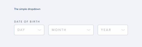
The simple dropdown
This type of input field asks you to pick the day, month, and year of your date of birth separately. Although it seems quite straightforward, it requires a lot of scrolling, especially for older people. So, in most cases, we notice that users tend to feel either very old or very underaged. Besides that, how do you determine a good default date?
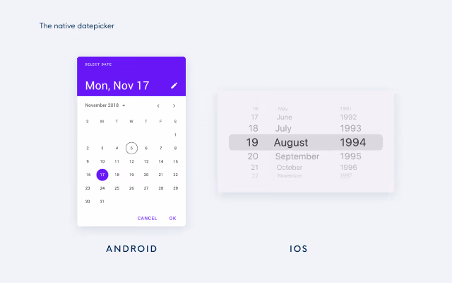
The native date picker
Next up is the native date picker. This DOB picker asks you to select a date from a calendar that pops up once you click on the input field. We see this both on Desktop and on Mobile. Although you might think that this solution is thought through as this is a native solution, it creates issues similar to the simple dropdown. It is nearly impossible to choose a good default date so users need to click or tap a lot to find their date of birth. This method was designed with the false assumption in mind that it's less effort to select a date of birth than to type it. In other words, native date pickers are not suitable for dates of birth and it is better to limit their use to other types of date picking, eg. scheduling an appointment in the near future.
We see this type of date picker both on Android and iOS devices:
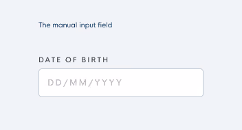
The manual input field
The last, most seen method is the date of birth field with only one input field for the day - month - year. As soon as you start typing, the placeholder disappears. Since people are used to different formats, this method makes it impossible for users to check whether they have entered their date of birth right according to the format. Other than that, users are often confused about what separator they are allowed to enter in the field. Sometimes the field requires the use of a comma as a separator, sometimes the use of a slash or dash is required, and in some cases, an error is thrown when separators are typed because no separators are allowed.
In other words, it is tricky for users to fill in the right format. And last but not least, this input field is also harder to perform inline validation on because more error states are possible (eg. you can use the wrong type of characters) and some incorrect input can not be detected (eg. switching day and month by mistake).
You heard it, a lot of hassle just to enter your birthday right.
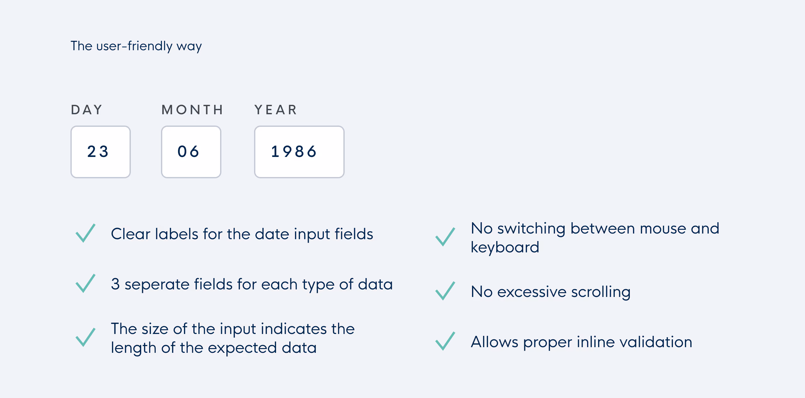
Let's see how it's done, the user-friendly way
The best way to ask someone’s date of birth is to avoid asking it altogether and to retrieve it from a social or governmental login like Itsme or Google instead. However, not everyone wants to use these logins so your solution might not work for them. In this case, the format of 3 separate input fields for day, month, and year seems the most user-friendly way of asking the date of birth.
Why? With its clear labels it prevents users from making mistakes against the date format and the labels allow them to double-check their input easily, it is not possible to accidentally enter wrong date formats, no excessive scrolling or tapping through months and years is needed and no default date should be set. Other than that, it is technically easy to validate the 3 input fields as no separators need to be checked and no wrong date formats can be used.
The only possible downside is that you need your tab to go from one field to another but compared to the excessive scrolling and tapping in native date pickers and dropdowns, we only see this as a minor issue.