We regularly order food at Deliveroo for a bunch of colleagues when we’re working at the office. But there’s one thing you can bet on to go wrong every time we create a group order; a double or missing order for one of us. Why does that happen so often? Due to a UX design flaw. Let’s see why this is an example of UX frustration and how they could change it for the better.
Ordering for pro's
A while ago, Deliveroo introduced the possibility to create group orders. Since we regularly order food for a bunch of colleagues, we think this is a nice addition; now everyone can just add their own order instead of one person having to collect and add everything. However, it has already happened that one of the colleagues was left without lunch because their order did not get through. The culprit was a UX design flaw.
This is how it happens: when adding your order, you choose all the options for your dish and then click on the “Add” button.
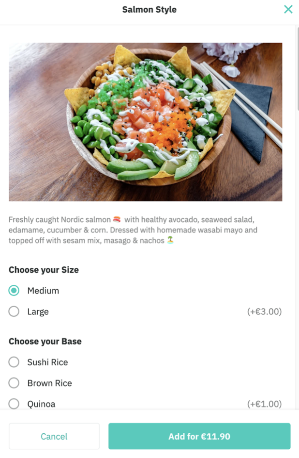
As you would assume based on the online order experience you already had in the past, the item is then added to your cart. However, at that point, the item is not added to the group order yet! For that, you need to click on “Add to order”.
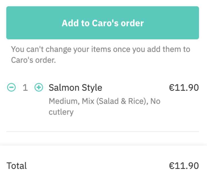
In the regular Deliveroo order flow, this button reads “Go to checkout”. So it’s no surprise that if you don’t pay close attention to what is written on the button, you assume that it’s also a checkout button in this case. If you’re not the one who's organizing the group order, you don’t need to check out so you ignore the button. And that is how people end up hangry and without lunch… The reason behind this flow is probably a technical one, but hopefully, Deliveroo can solve this in the near future.
On the other hand, when you click the “Add to order” button, you’ll see a wheel that keeps on spinning until the order has actually been placed by the group order owner. This is quite confusing because you might think that your order didn’t come through. So what do you do? Oh yes, you try again. That is how multiple orders for one person keep on happening.
Time to steal some ideas from your competitors, Deliveroo
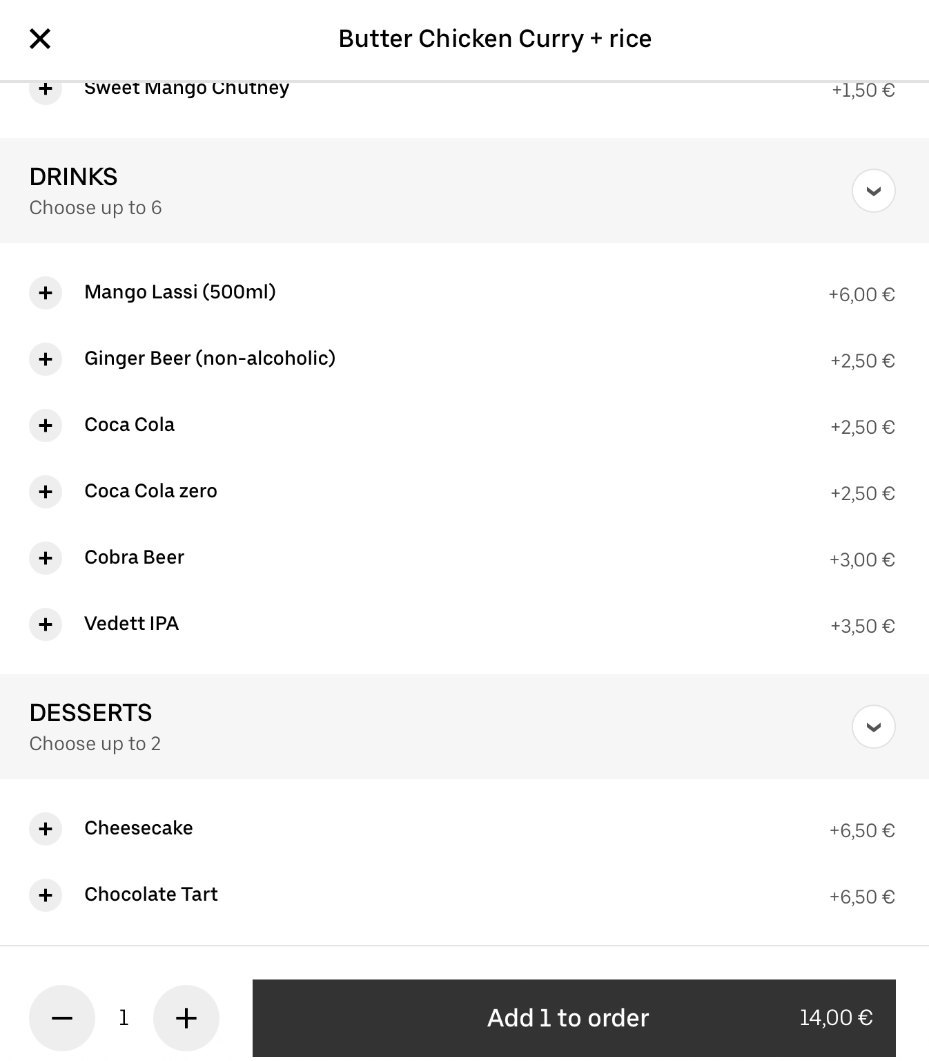
When we compare Deliveroo’s way of working to Uber Eats group order, we see some remarkable differences. In the Uber Eats group order, you easily add your choice to the group. You receive an invitation from the owner of the group order, you fill in your name and have a look at the menu. After making your selection, you just click on the button below "Add 1 to order". That's all there is to it, after clicking this button your order is added to the group order.
After adding your order, a green banner pops up where you can see that your order came through. This is an extra confirmation, you're now sure that the order is added to the group.
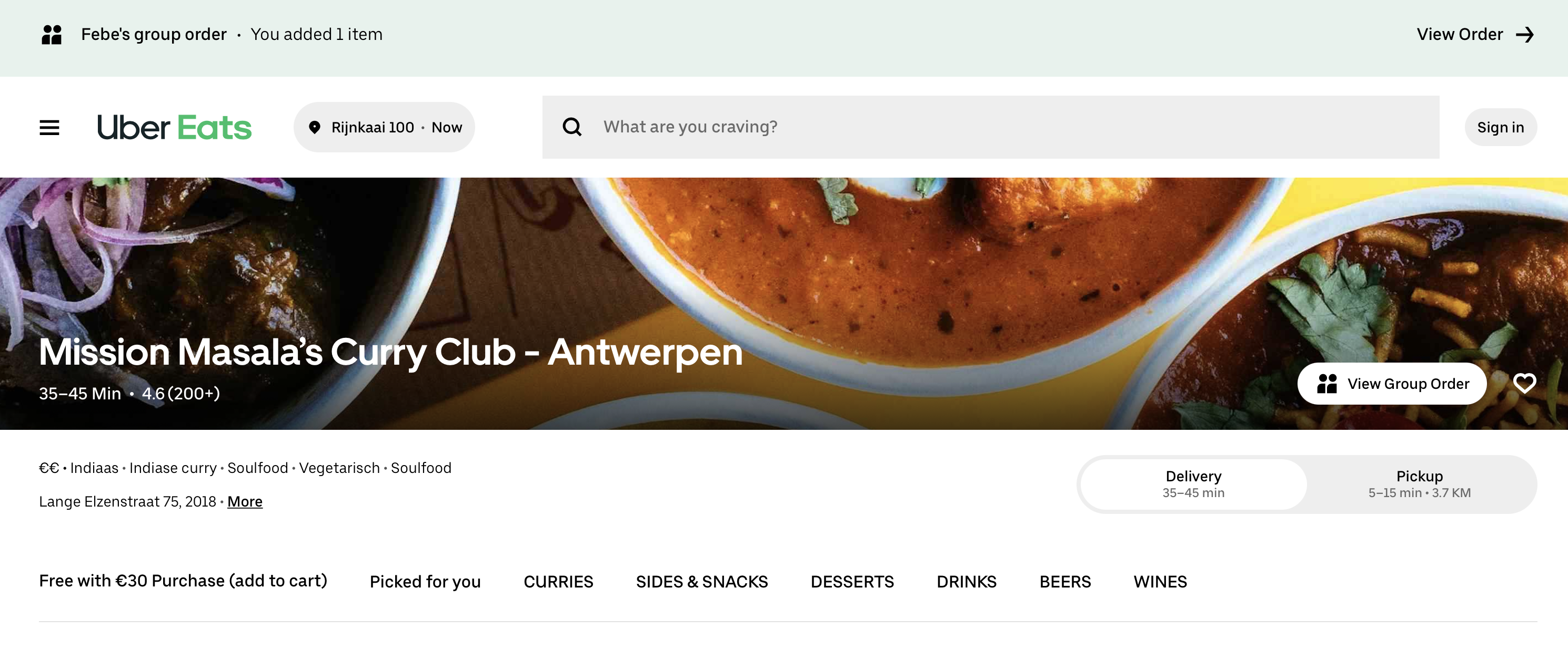
By clicking "View Order", you can even double-check what you ordered or you can make changes to it if necessary. Or if you want to see what your colleagues ordered, in case of lack of inspiration, you can easily open the group order and have a look.
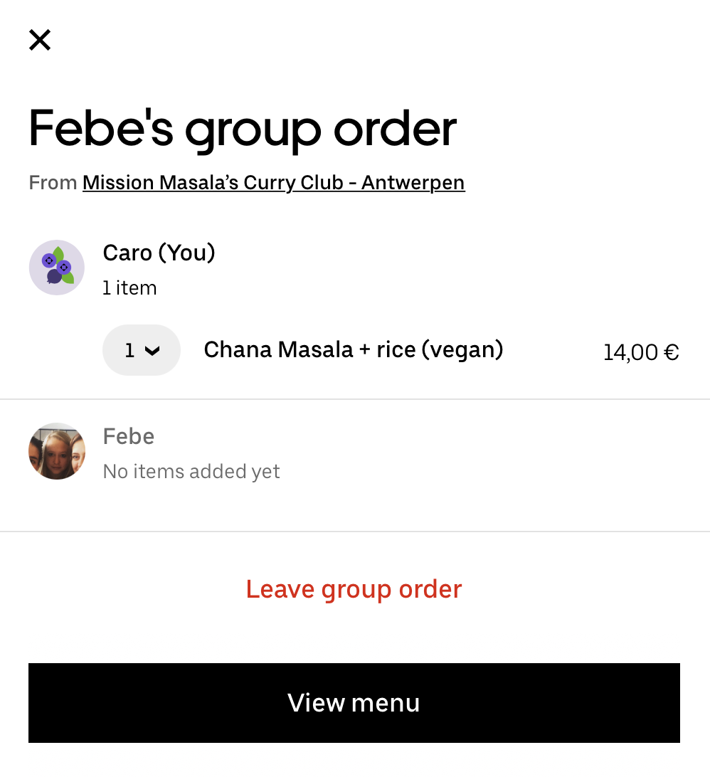
Because of this double-check and the order confirmation banner, mistakes are avoided and people can enjoy their lunch without any frustrations. So here you go, Deliveroo, time to make this feature a little more user-friendly.
Other than that, we're still very happy with your services and delicious food!
