User experience of your daily Frustrations: Smartschool
Smartschool is used by a lot of schools to manage everything digital for teachers and students from primary to secondary education. Smartschool has a mobile and web version and the portal contains lots and lots of useful functions for teachers, students, and parents, like calendars, messages,... Although it’s such a useful tool, at least that’s the intention, we bet you’ve heard all of the users complaining about it. Why is that?
Maybe because their UX doesn’t answer the user’s needs? In this blog, we’ll figure out what’s “wrong” with this portal and we’ll focus on our view on the secondary teacher’s side of the software, both mobile and web. In the end, they are the daily and main users. Our UI designer, Pieter Matthieu, tested the portal and made notes about some rather weird design choices.
Inconsistency
Using icons, fonts, layouts consistently can help the user recognize patterns and it can make the use of an application easier. Unfortunately, the designers of Smartschool didn’t get this memo. New users will need days to learn the different ways of working within the portal. I counted 7 different types of calendars, each different to work with.
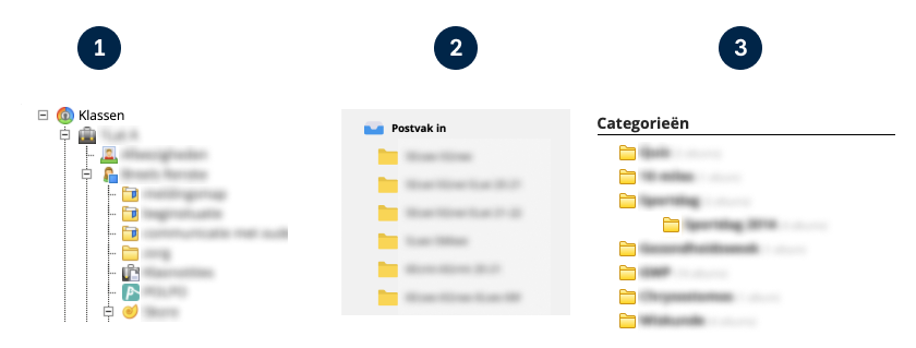
For example; File browsing and layering should not be different.
Both layer structures have their pros and cons but work very differently. Try to stick to one design. This way, users can focus on their actual task instead of figuring out how to work with it due to a varying UI.
Missing search functionality
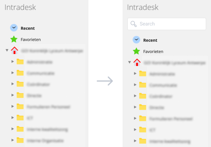
With a ton of files and folders, it can be a struggle to find items quickly. Sometimes Smartschool uses tags like Recent or Favorites, which are handy but don’t feel like they add enough clarity. What’s missing is a search function, which isn’t implemented everywhere. The search function will help the user a lot when trying to find the correct file or folder, and it will save them an enormous amount of time. Making it possible for teachers to use the portal more efficiently.
On the web version, there’s a search function on the top bar that lets the user search the whole platform. On the mobile version, however, this is absent.
Missing features in the app
Some essential features that are available on the web version are, unfortunately, not available on the app version. Like the instruction manual, search, and some of the modules. This can lead to a frustrating user experience on the application.
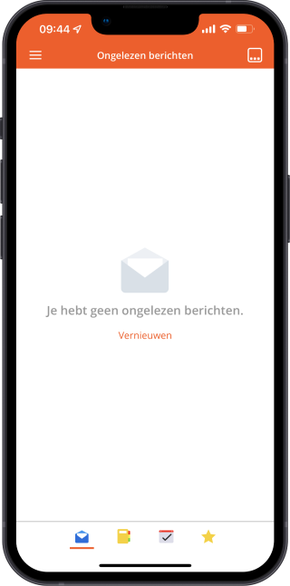
Another frustrating experience is the unread messages screen, which is the first screen you see when opening the app. If there are no unread messages it shows an empty screen and there is no quick way to see all your previous messages.
Outdated look & feel
In some (but not all) screens the design looks like an old version of windows. Having a fresh look & feel will improve the user’s satisfaction and keep the user interested. It’s the first thing users will notice about your website, so make sure their first impression is positive. Good UI will make the user want to use the product more.
The good: Instructions
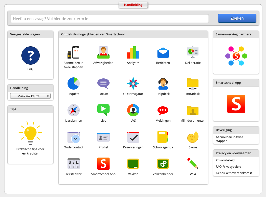
Luckily Smartschool realized that having lots of different modules can be confusing for the user. That’s why they put a lot of work into the instructions, or so it seems. When pressing the question mark in the top bar on the top right it opens a huge library of information. It even contains some instruction videos. Well done!
The reviews
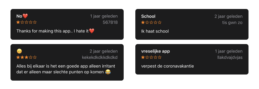
When doing some research I came across the reviews in the app store from which I was hoping to find some feedback, but what I found was quite unexpected. 99% of the app store reviews were about their school frustrations and Smartschool had to take the blame for it. Here are some of the best ones:
So what do we learn from this blog?
Stay consistent with the use of icons, fonts, and layouts.
If you add a search field, add it everywhere.
Add all missing features in the app.
Treat yourself to an updated look and feel. ;)
So Smartschool, there is definitely room for improvement! But hey, that's what we're here for.
Let's get digital!

