We talk about accessibility a lot, but how do we manage to make our application accessible to everyone? Designers already know the importance of accessibility, and developers are also raising awareness. Still, when you didn’t experience inaccessibility by yourself, it’s sometimes hard to imagine how you can improve it. These practical tips will help you along.
First things first, why can accessibility become essential to anyone?
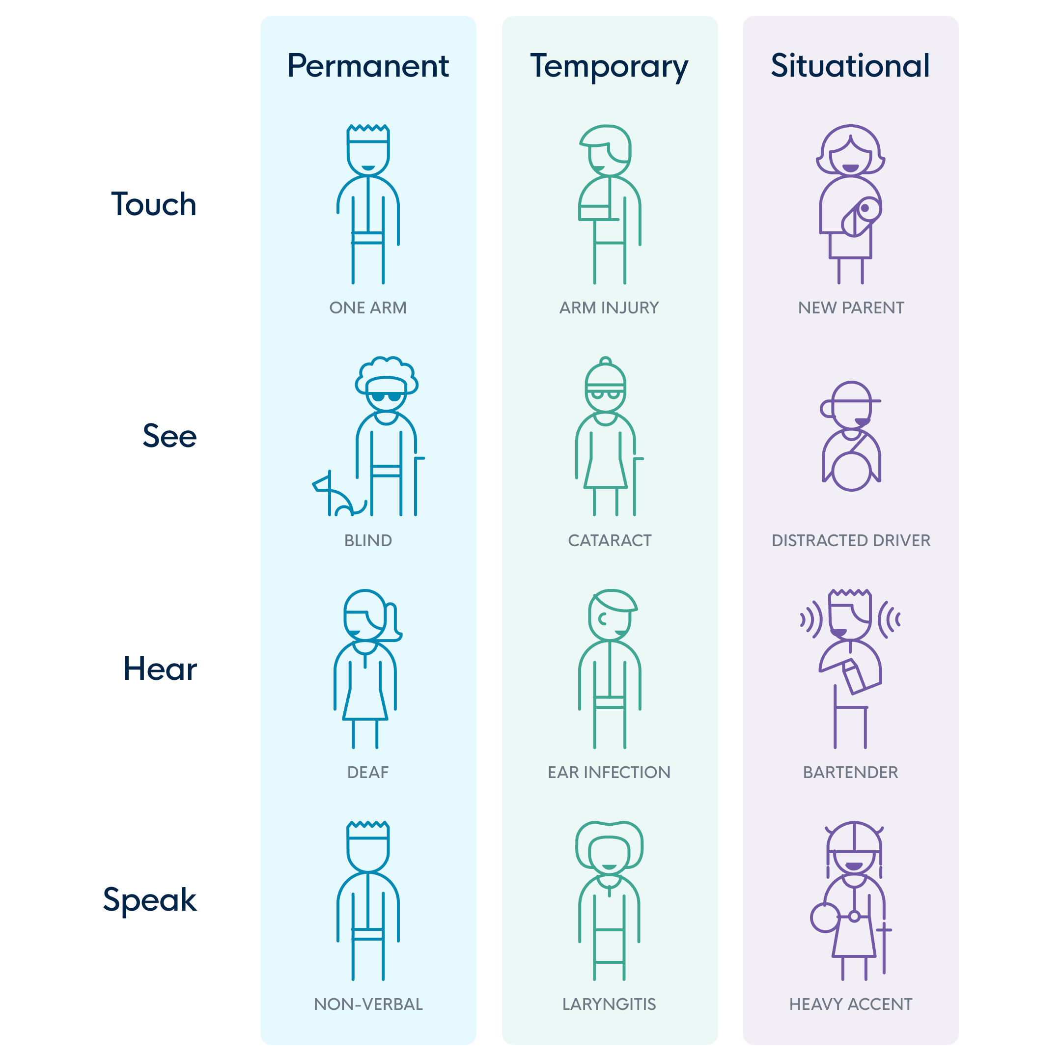
When we talk about accessibility, you probably instantly think it’s only essential for users with a certain level of impairment. On the one hand, that’s true. On the other hand, it can also be essential for people who are temporarily impaired. Imagine how difficult it would be to handle your smartphone when you have a broken thumb, when Siri can’t hear you due to ambient noise, or when the sunlight prevents you from reading what’s on your screen. This is only a temporary challenge. Still, you get to experience why accessibility is this important. There are different forms of inaccessibility, some are permanent, some temporary, and some situational.
Some non-negotiable best practices
To make your app accessible, there are some ground rules set out that are non-negotiable. Let’s get you some insights into them:
1. Don't put your text in images
Because:
It cannot be interpreted by screen readers or (SEO) bots
It’s often not readable on mobile devices
Visually impaired users can’t scale it
Sidenote: If you don’t have a choice but to incorporate text into an image, make sure that the `alt` attribute describes what is seen in the image as closely as possible.
2. Put your labels in the right place
Ensure your labels are close enough to your input field, especially when using a magnifier. That way, your user will always see what information they need to fill in, and they don’t have to scroll up and down the screen.
3. Make your colors pop
Check your color contrast and ensure your chosen colors are visible to people with visual impairment. There are useful Figma plugins to help you; think of Stark, for example. Although you need to be aware that they aren’t flawless, there are limitations to them. In one of our previous blog posts, we zoom in on this topic; https://icapps.com/blog/design-visual-impairments.
For the new WCAG 3.0 (Web content accessibility guidelines), there are extra tools available like https://contrast.tools/
4. Fonts matter
In terms of text, you need to focus on using the right, most readable font. Use enough whitespace and make sure the alignment of your text is justified. Other than the visibility of your text, you need to ensure your content is understandable for everyone using your digital product. A good rule of thumb is to think you’re writing your copy for a 15-year-old.
5. Focus indication
All interactive components must be visible when selected, not just with color (because of color blindness). They must be placed in a logical order so a user can easily navigate/tab through the page.
6. Optimize
Make sure your design or accessibility adjustments are applied to all devices. That way, you’ll service everyone with your changes.
Scratching your head after reading this because you have no clue where to start? We happily help you make your digital product as accessible as it can be!

