We use Mailchimp for all of our e-mail campaigns. For most marketers, it’s a well-known emailing tool, but still, we feel there is a lot that can be improved. Some relatively small things you can’t believe still don’t work appropriately in such a great, commonly used tool. I must admit, I’m frustrated every time I use Mailchimp, and my colleagues can confirm it given the “swearing.” So. For the love of God - Mailchimp - get it together.
Let’s look at our biggest frustrations and how we believe Mailchimp could fix them.
Text editing in the dark
For our B2B mailing campaign, we work with white text on a dark background. Mailchimp allows you to set your background to dark, so you would think they adjust their text editing field to your needs. But no. When you want white text on a dark background, you can’t see your text in your editing field. What’s up with that, Mailchimp?
Adjusting your text is like searching for something in the dark. You must guess where the comma, word, or letter is you want to rewrite. By selecting your text, you can see it. Or you need to change the text color to dark so you read and adjust it. But is that user-friendly? We have our doubts.
Other than that, you can’t see the font or the size of your text in the edit section. Why, Mailchimp, why?
Forgot to change the link, again
I don’t have to tell any content marketeer or communication expert how frustrating it is to send out an e-mail to your whole database and notice there is still a mistake in it. I, for one, fall into pieces when I notice there is a wrong link in my e-mail. Such a shame. And sending an apology mail is rather embarrassing.
So, although it might be with the best intentions, I wouldn’t mind if Mailchimp didn’t copy my links behind images, buttons, … or at least give me the option to choose.
For some mailings, it might be useful to copy the links because you maybe want to send the same mailing with some minor changes to different target audiences. But if you just use the template, duplicate it and change the content, it’s annoying to notice the links are copied. If you don’t want to add a link to a specific image or piece of content, you might not notice that the previous one is still behind it.
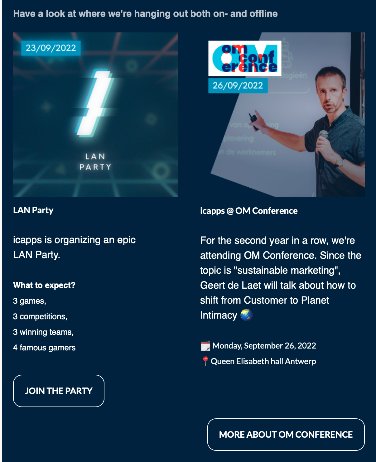
Double column, single button
Mailchimp provides some standard blocks for layout, you can choose a content block with text and images, just text, a single image, and image blocks, but you can also add a column with image and text blocks.
We use this column a lot; it’s an easy way to add content in a structured manner without turning your e-mail into an endless scrolling game. We use this, for example, to announce two different events, blog posts, … But when we want to add 2 CTA’s, it’s impossible to outline them under the content blocks. We need to add two different CTA’s, outline one to the left and the next one to the right. There is absolutely no logic in that.
Other than these things, we feel we are pretty limited in editing images, changing the layout, and adjusting the style of a mailing. And don’t get me started on the countless times Mailchimp got stuck, making me lose all of my changes. For one of the most used, very well-known e-mailing platforms, we feel there are still significant improvements to make this platform more user-friendly. Do you agree?


