A pandemic, like Covid19, has a lot of impact on different aspects of life. We had to change our way of interacting completely, we needed to work from home 24/7, learn how to interact in online meetings, … We don’t only see a lot of changes that impacted our daily lives, but also changes that have an impact on many different areas. Since we’re a digital company, we need to keep a hold of these changes, so we take time to investigate the latest trends and innovations and how they impact digital transformation. In this blog post, our UX designer Maaike Couchez and UI designer Pieter Mathieu, shine their light on 10 shifts in design trends they noticed since the pandemic.
1. Low touch economy - Provide contactless alternatives
As the pandemic suddenly surprised us in 2020 and our healthcare facilities were almost pushed over their full capacity, our social contacts were restricted to a minimum. People and companies were forced to rethink their habits and their way of working to make sure contact was limited whenever possible. This implied that people became more aware of the possible transmission or contamination risks physical contact involves. Since we had to keep our distance at all times, we learned to partially fall back on contactless solutions to prevent the covid19 numbers from rising again.
You clearly saw the impact on our daily lives and on our mental health, but how did this impact UX?
Whenever solutions are safe in terms of contamination, we should inform or ensure the user by providing a tag ‘Contactless’. Being able to provide contactless solutions can be a selling point these days.
When designing customer journeys, we need to ask ourselves if we can provide contactless alternatives and implement them wherever possible.
2. Remote UX testing - User research is more important than ever
Typically, when creating digital solutions, you start from assumptions about the behavior of your users, based on previous user research. You use these assumptions to make choices in how the product should be designed. But to ensure the success of your product, you need to validate these assumptions. You can do this by performing user interviews and validating your solution through usability testing.
The pandemic changed the behavior of our users drastically. This implies that we can no longer rely on our existing user research. Therefore, user validation became more important than ever. But, due to the pandemic, fewer people are willing to come over for user interviews and usability testing in person. So remote usability testing tools and skills became really important if not urgent.
3. Digitalization of physical products is no longer sufficient, tools should allow real-time collaboration
For some time, we have been obligated to work from home, and we believe this won’t be over soon. While working from home, people prefer tools that not only digitalize a physical product but also allow collaboration. With collaboration, we mean that you can access and edit the same file at the same time, and really work together with your colleagues.
If you would take a physical whiteboard, for example, it wouldn't be sufficient to only create a digital variant of a whiteboard but the whiteboard should also allow collaboration and co-creation by multiple users at the same time. Useful UX tools that allow real-time collaboration remotely are Figma and Miro.
4. Your online representation became way more important
Your online representation as a company is no longer an extra, it became a must. The digital maturity of users has increased drastically during the pandemic. And so did their expectations. For example, in e-commerce, we saw shops in competitive industries that shaped up their UX game and gained a bigger market share. In other words, just being online is not enough if you want and need to be competitive, the experience of your online representation matters, and UX can be a competitive advantage.
5. Uncertainty about constantly changing regulations requires flexibility and real-time information
It’s unclear what the governmental regulations will be in the upcoming months as the situation changes constantly due to the pandemic. The regulations depend on a lot of factors (eg. Will there be a new variant? Will the effectiveness of vaccination be sufficient for new variants or for a longer period). This means that people have difficulties committing to their future plans. When designing new customer journeys, it is important to think about flexibility in the product offering.
Eg. When designing a customer journey where people can purchase tickets to larger events or plan a holiday, you need to ask yourself how you can add flexibility to people's purchases. Additionally, we need to make sure that when building a new solution, we can give users real-time information about the impact of new regulations on their booking.
6. Protecting users from fake news
The past years were so unexpected and surreal that many people had difficulties believing it and started searching for explanations. When searching for information, it can be hard to distinct trustworthy news from fake news.
When designing new solutions or creating new content:
You can help people by explaining information on a basic level so that everyone will understand. Especially for topics, not everyone is familiar with. Animations can be helpful.
Provide sufficient in-depth information so that people feel less need to search for more.
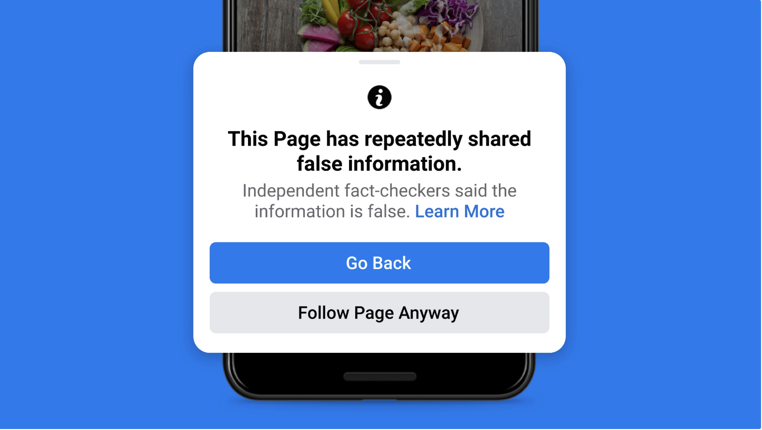
In case you don't own content on your platform and people are writing about a topic that is known to be sensitive to conspiracy theories, make sure that when the topic is mentioned you provide a link to trustworthy information. We saw this tactic before with large social media platforms, like Facebook, Instagram & Twitter.
7. Bring the outdoors to your screen
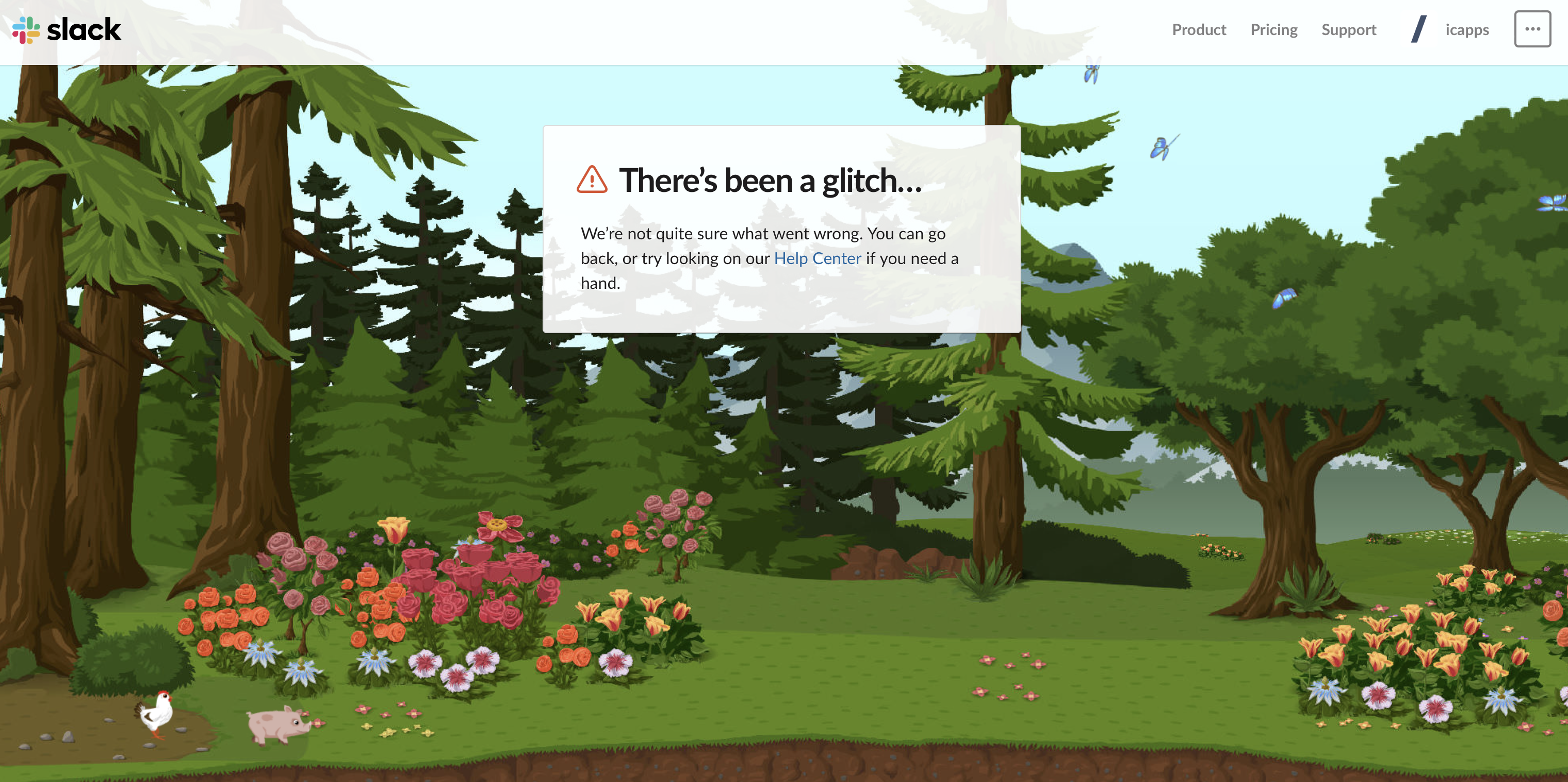
Lots of applications did this before, but now it’s more important than ever. People started to notice the importance of being surrounded by nature. We’re all stuck at home, and seeing images of nature can be calming and inspiring. Even when they're just images on your screen.
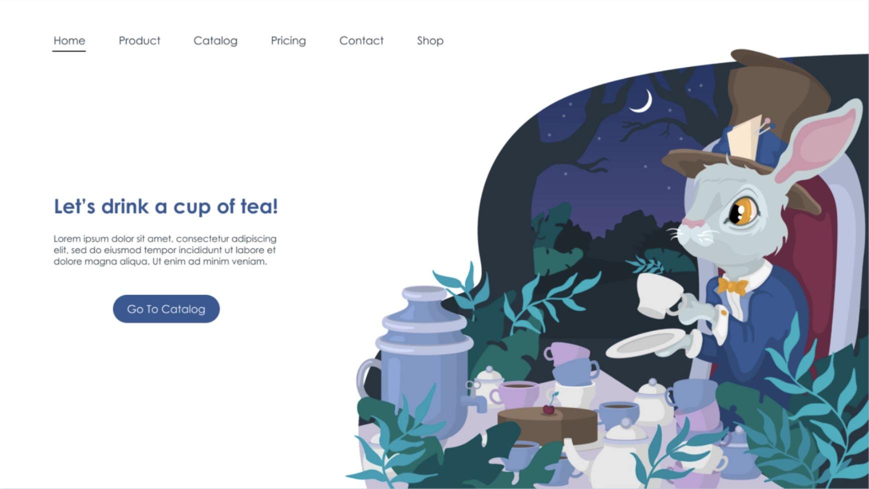
Another example by Teashop:
8. Make users happy
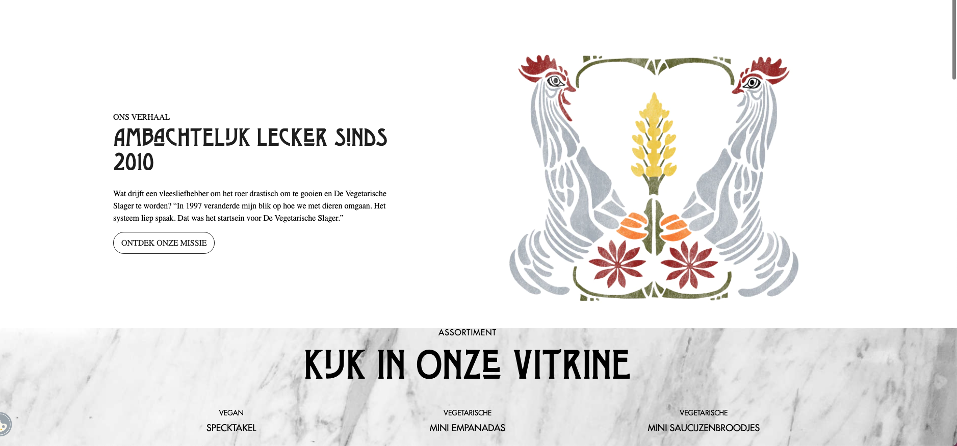
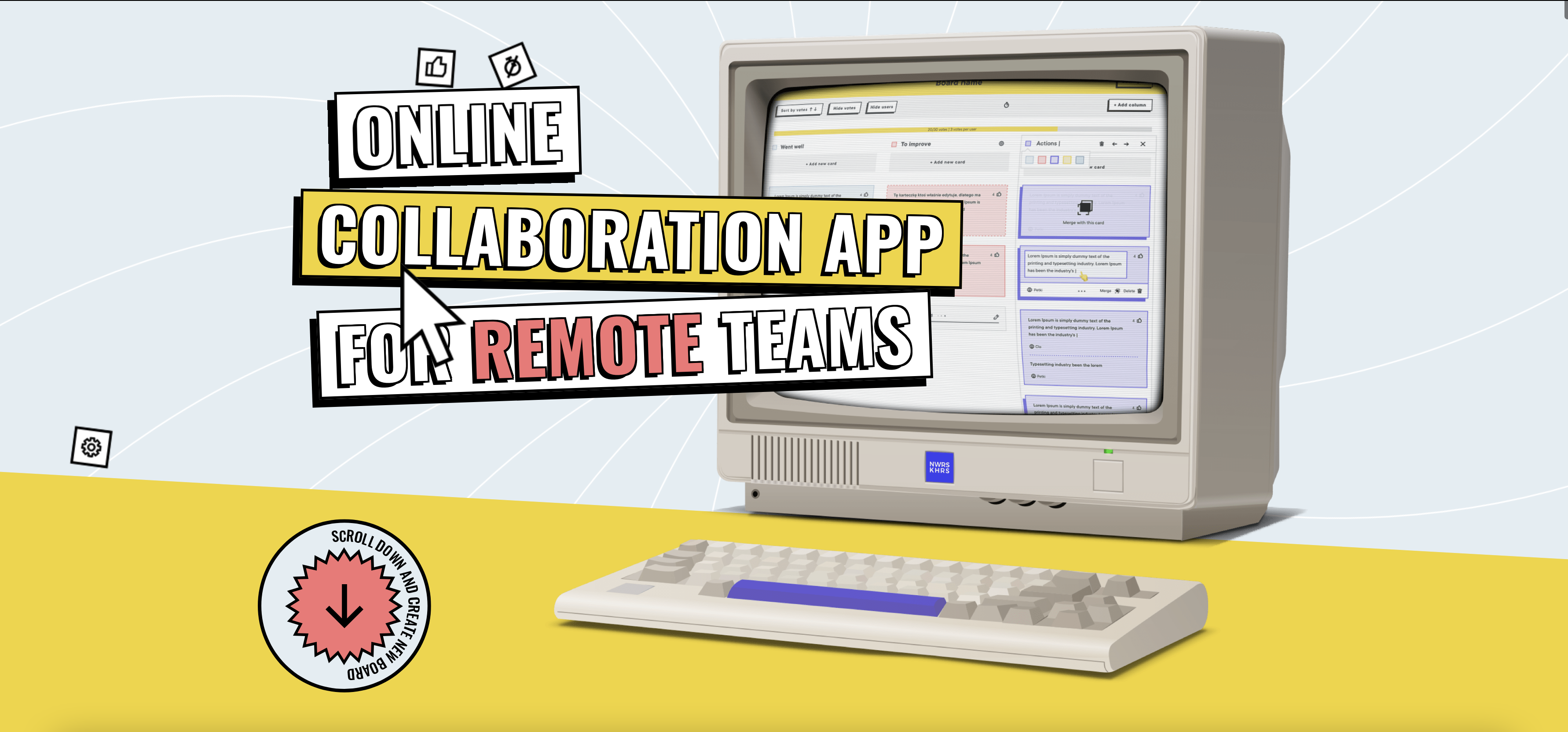
Share positivity through your designs. We've all had enough of the bad news, so add some lightness by keeping your designs playfully, it will help. Although, you need to keep it simple, so don’t overcomplicate your designs as this will confuse the user.
How to do this?
Vibrant colors, 3D figures & illustrations, animations
Share inspiring quotes when a user needs to wait, eg. about patience or a general quote
A website design of de Vegetarische Slager:
Website: Vintageria

Another website example:
9. Evaluate post covid applications
If you go to your local restaurant, you'll probably have to scan the QR code on the table to find the menu online. Some restaurants even ask you to order via your phone. While this is a good alternative, we’ve come across some websites that have been put up very quickly, and it shows. Now, as the dust has settled a little bit, it’s time to evaluate those applications and up their UX game. Because this might not be what it should be so it's important to further iterate and optimize the customer journey and experience.
10. Keep in mind: not everyone is digitally experienced
Lots of companies rushed into digital transformation, for example through their internal communication. We assume everyone to follow but often forget there are lots of users who are not as digitally-minded as you might think. They are forced to work from home and use their computer, even when that might not have been the case before. This can lead to frustration. A focus on accessibility and simplicity will help non-tech-savvy people to cross the bridge. It will not only benefit less digital mature people but also help digital mature people to navigate digital solutions more efficiently and smoothly.
