Television has evolved from a clunky box with black-and-white images and a few channels to pick from to an interactive platform. At icapps, we’ve designed apps for Telenet TADAAM, Proximus Pickx, VRT NU, and Liberty Global’s Horizon Go platform (launched into the market under different brand names such as Ziggo, Virgin…). We’ll share our experiences on how to design for TV, including some examples from these projects.
Take the user’s context into account (of course) 😏
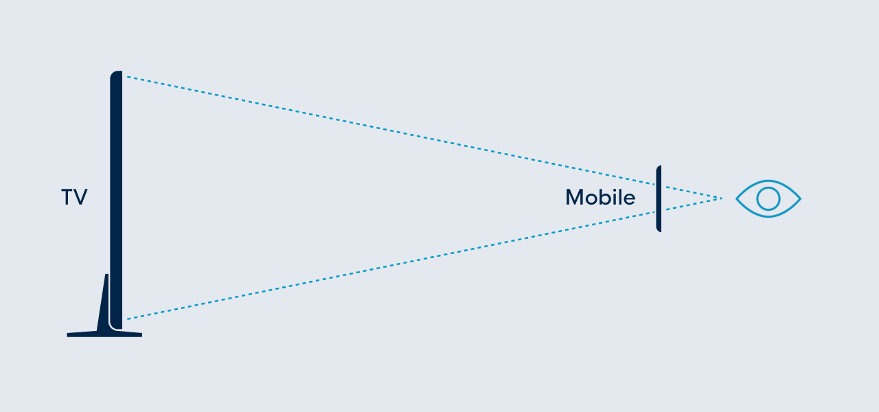
When people are watching TV, they are far, far away from their screen. Instead of looking at a phone or laptop screen from a short distance, they usually slouch on their couch at a few meters distance. And even when their TV has a 60” screen when compared to their 6” phone, that doesn’t mean you should cram more information onto that huge screen just because you have more space. So when designing for TV, lower the information density and provide enough spacing between elements. More space does not necessarily mean more content at once!
Also, a TV is not a suitable medium for reading or processing a lot of information, so minimize the amount of text. For the (limited) text you put on a TV screen, make sure the font size is large enough to be legible at a distance. For example, Apple suggestsa body size of 29pt for TV.
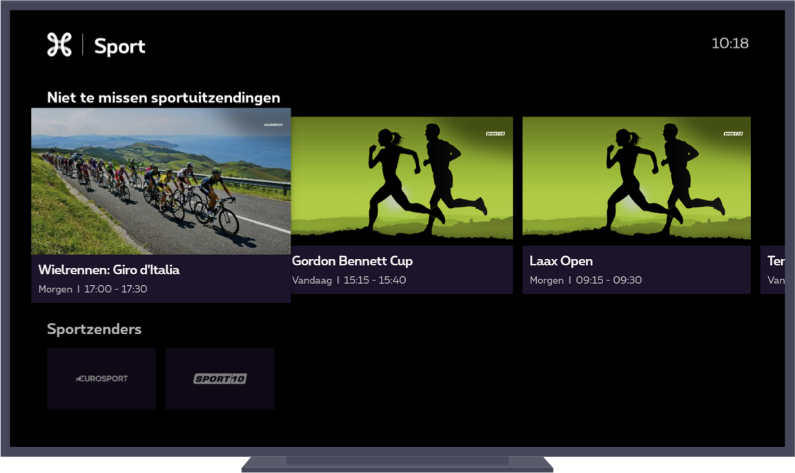
Here’s an example from Proximus Pickx's new decoder interface: they use big tiles, so only 3 items are visible at once in a row.
When watching TV, you just want to relax and be entertained. Don’t let users work (or navigate through endless menus) to get to something that they want to watch. Recent research proves that 4 out of 10 people turn off the TV when they have to search for too long. They also indicated that they can be paralyzed by the overload of options. So it’s better to offer suggestions & recommendations straight away, based on their profile, what is popular or editorial suggestions.
In the TADAAM-app, we show users suggestions based on what our content editors consider worth watching in the upcoming days. Users get automatic content recommendations based on what users with a similar taste watched.
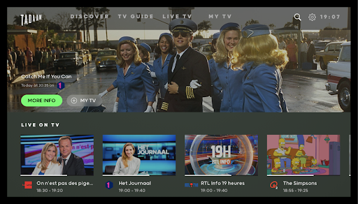
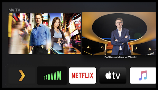
But TADAAM doesn’t only show recommendations in the app itself. On AppleTV, the app already shows you suggestions on the home screen:
Users are not used to loading times on a TV. Normally, you turn on the TV and it instantly shows you something. If you don’t like what you see, you change the channel - but at least you don’t have to wait before you get something to watch. So as designers, it is important to minimize the (perceived) waiting times. You can do this by showing placeholder contentas soon as possible, e.g. by showing a placeholder image while content is loading. That will make the wait seem shorter. If showing placeholders is not possible or relevant, you could use the loading screen to entertain or educate. E.g. show tips on how to use the UI, or show a custom animation.
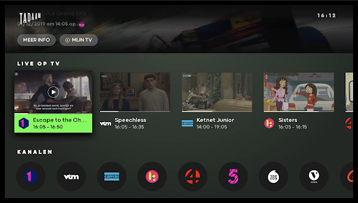
In theTADAAM apps, we thought it would be boring to show a spinner while a stream is starting. That’s why we already show a still image from the show, which is both connected to the content you are about to watch and makes the wait seem less long.
Work around hardware restrictions 🚧
TVs are a little different when compared to your usual smartphone, tablet, or laptop screens. As people don’t buy a new TV every two years, most of them have a device at home that is a few years old and has some limitations.
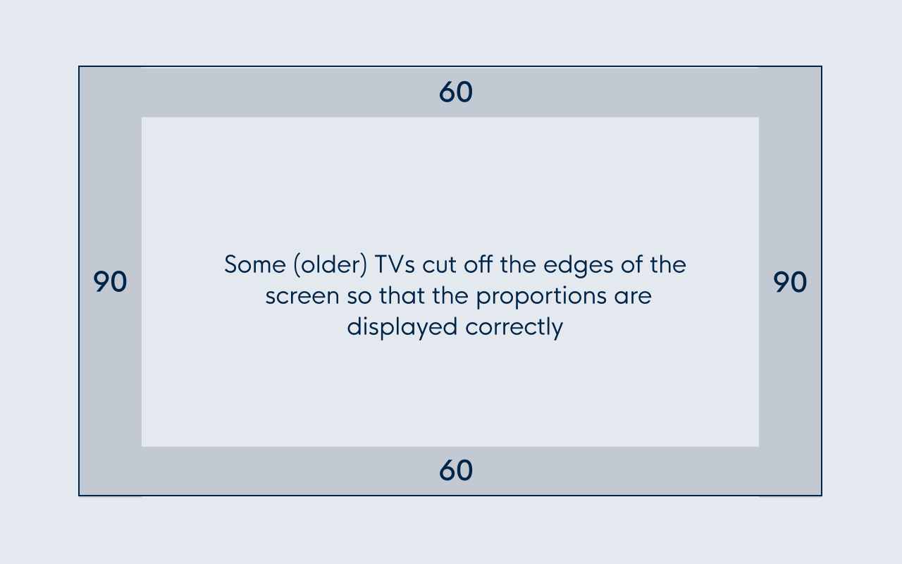
One of those limitations is overscan; some (older) TVs cut off the edges of the screen so that the proportions are displayed correctly. To be safe and to avoid important content being cut off, take into account a top and bottom margin of about 60px, and left and right margin of 90px.
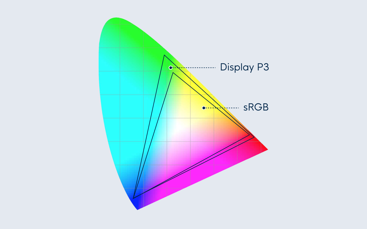
Another important difference between high-end smartphone or computer screens and TVs is the color spectrum they support. For TVs, the range is much smaller, but it differs from device to device. Also the brightness, contrast, and display quality vary a lot. Again, the newest TVs have better quality screens but remember what we just said; most consumers don’t buy a new TV regularly. So your nice-looking design, displayed on your computer screen, might not look so nice with a more limited color range on a TV. So, find a range of old-ish TV sets, and test your design to check how it looks with different color settings.
Another one to take into account is that users will often watch TV in a dark room. As most TVs have a higher contrast than computer screens, colors often look more saturated and bright. So go easy on the saturated colors. As a general rule, cool colors (blue, purple, grey) work better than warmer colors (red, orange, yellow). And never use pure white as it might cause the image to flicker. A very light grey is a better choice; e.g. #EEEEEE, as is suggested in the Android TV guidelines.
All this makes it extremely important to test your designs on different TV models. Even when you compare only one TV to your laptop screen, you’ll notice a huge difference and might need to adjust your designs to accommodate them.
In some cases, it can also be useful to have a light mode and a dark mode. For example, YouTube Kids on AppleTV uses a light theme. This way a parent can see at a glance that the kids are using the kid-friendly version of YouTube.
This example from Proximus shows how we used a dark background and a few bright colors for highlights.
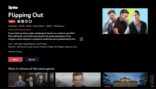
Make sure you optimize your design assets for big screens. For TV, you design on a 1920x1080 canvas. Apple Tv OS will automatically scale your designs up or down, depending on the TV’s size. Since people buy 4K TVs more often, the default image export size is @2x. For smaller TVs, a lower @1x resolution will be used.
It’s not just the screen, also the way to navigate it is different 👀
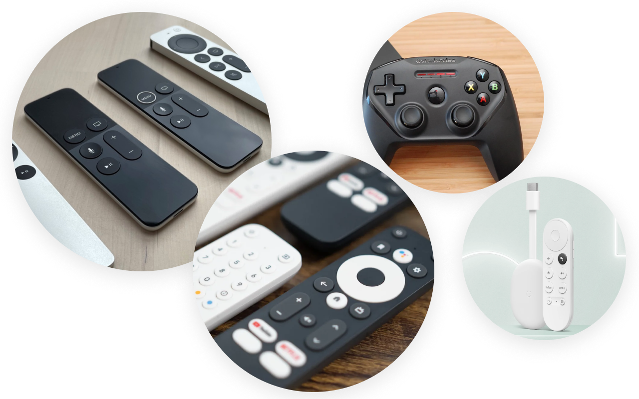
A TV is not a touch screen and in most cases, consumers have to use a remote. The problem is that there are a lot of different remotes available
If you only design for Apple TV, it’s easier as the remote’s interactions are very well-defined. Apple has multiple versions of their remote (Apple TV Remote / Siri Remote I / Siri Remote II) but they all support the same gestures: swipe, tap & click. An additional extra on the latest remote is the possibility to scrub forward and backward in the video player by sliding your finger along the wheel (very similar to the first iPods 😉).
When designing for Android TV there are additional difficulties because there is no 1 standard remote for Android TV devices. And it gets worse… Both Apple TV and Android TV support game controllers, so you’ll have to consider this as well when designing interactions. Most people won’t use their game controller that often unless they have lost or broken their usual remote.
But let’s talk a little about the Apple TV remote. It supports the well-known standard TVOS gestures, like swipe, click & tap. The Menu-button always brings you back one level. Be careful not to redefine standard TVOS gestures because this will lead to confusion (E.g. don’t use the Menu-button to confirm). People are familiar with the standard gestures and will have trouble being forced to learn new ones. There is one exception though: if you are designing a game, the rules are less strict. Game UIs don’t always follow the standard rules and in that case, it is OK to redefine button behavior in case it is necessary within the game.
For Apple TV, it is also important to differentiate between a click and a tap on the remote. For example, don’t start a movie on tap (or worse, buy a movie), as this is a disruptive action that you don’t want to happen accidentally. Tap gestures are fine for navigation or showing additional info.
The Android TV remote is not really standardized, even the Home-icon looks different on different remotes. Some remotes also have a play/pause button, some don’t. Some remotes have a channel up/down button, some don’t. But all have some form of the directional pad, a Select/OK-button, a Home-button, and a Back-button. That means you should always design your UI to work with this minimum set of buttons (e.g. make sure your video player had a UI play/pause button because if the user’s remote does not have one, they cannot start a video). You should also consider including additional interactions in case the remote has other extra controls (e.g. play/pause, fast forward/rewind, voice control,…).
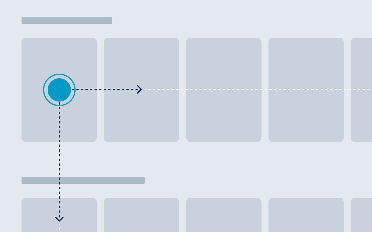
When navigating with a remote, you have to be aware that not all corners of the screen might be reachable. When you have a touch screen, users can tap anywhere they like. With a remote, they’ll have to use the up/down and left/right arrows to navigate - which means the most natural way to navigate through the UI elements is in a grid structure. This way users can navigate along a horizontal and vertical axis, similar to how you would use the arrow keys on your keyboard during an old-school game of Pac-Man.
Workarounds for the focus engine on AppleTV - i.e. how Apple TV determines which UI element is in focus when you swipe on the remote - are difficult, so try to stick to the standard Apple TV grids and layouts as much as possible. Customizing is great for a sleek look, but it will get you into trouble when you have to start developing.
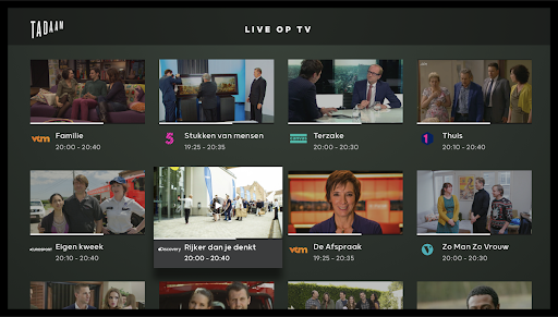
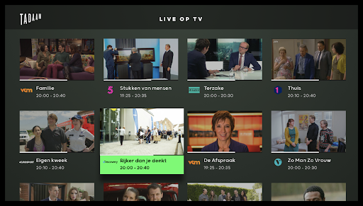
You’ll also want to highlight which element in your grid is currently selected, or “in focus”. A TV is typically in an environment that is full of distractions, so users need to be able to glance away and immediately know where the focus is when they look back.
You can also decide to have the element that is in focus always in the same location (e.g. at the start of a row ), and let the content scroll to it. This is how for example Netflix does it.
In this example from TADAAM, you can see the first design where we thought it was clear enough which element was in focus. However, after testing it on different TV devices and asking test users for feedback, it became clear that more contrast was needed, so we introduced brighter colors.
TV is not made for data entry
If you have ever logged in on an Apple TV, you’ll probably remember how slow and annoying it is to enter a username and password with the Apple TV remote.
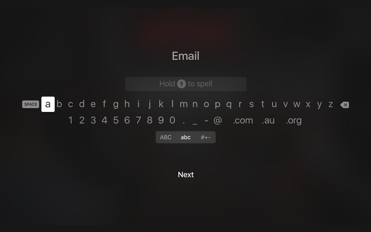
The first solution to this is to minimize the need for authentication. You could also try to delay the need for logging in as long as possible, and offer people something useful before you force them to log in. Let them browse your app and discover what you have to offer before they have to commit to the extra effort of logging in. People will also be more inclined to authenticate themselves if they get an extra value in exchange, e.g. if they get a more personalized experience like creating a watchlist or getting personalized suggestions.
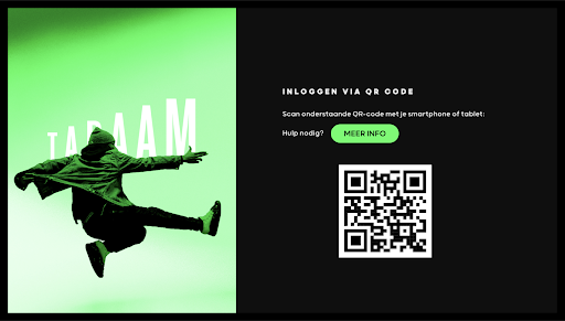
If your users do have to log in, make it as painless as possible. Examples of great alternative ways to log in are with a companion app that you can use on your phone (which is a lot easier for typing), or by scanning a QR code.
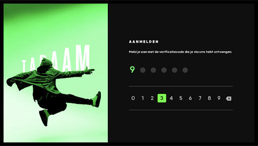
TADAAM offers a quick PIN-code login with a custom numeric keyboard, and a QR code that you can scan with a mobile device to log in:
Think outside the linear TV box 🤩
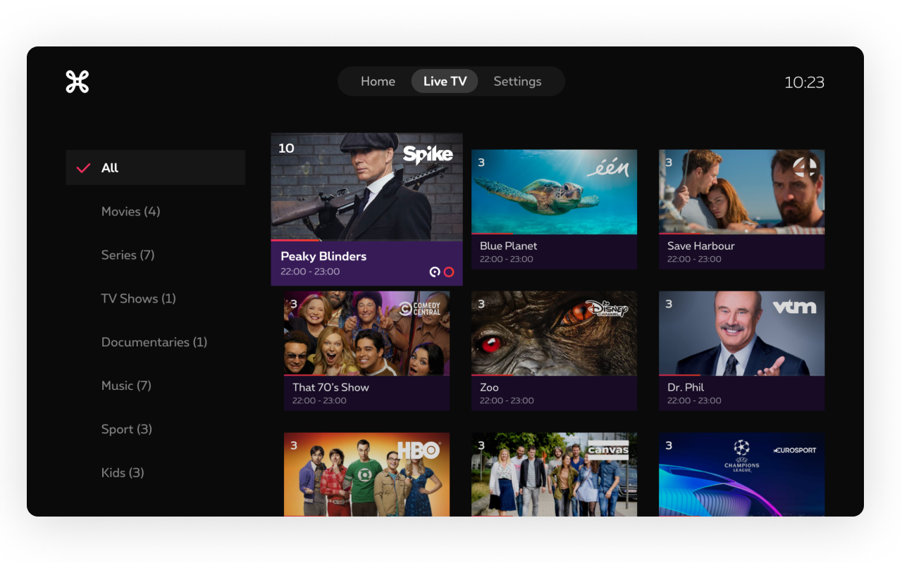
Even though people say linear TV is (almost) dead… we still have to design for it. Streaming services like Netflix are changing how we watch TV. Any content you would like to watch is available on-demand, and fewer and fewer people are happy with just watching what is on TV. Of course, people can use cloud recording and replay services to watch content that was previously linear only as if it were on-demand. So the possibility to watch whatever you want, whenever (and wherever) also influences people’s viewing behavior.
People don’t stay at home anymore to watch their favorite show, nor do they plan a TV moment at a specific time. The availability of mobile video apps has also increased the options for watching content when you are waiting at a bus stop or sitting in a waiting room trying to kill time. This influences other TV platforms as well. TV apps need to follow this trend and offer content based on how people want to consume it.
Don’t break platform-specific guidelines just for the sake of alignment 👯♀️
When you are designing an app that will be available on both TV platforms, web and mobile (and even on different TV platforms e.g. Apple TV and Android TV), you might be tempted to keep the designs and UI patterns identical. But if you do so, you overlook the broader context in which people use your application. When users open an Apple TV app, for example, they expect to see similar behavior as in other Apple TV apps. Also, UI patterns that work on mobile don’t necessarily work well on TV or web, or the other way around. So always follow platform-specific guidelines, don’t break them just for the sake of alignment.
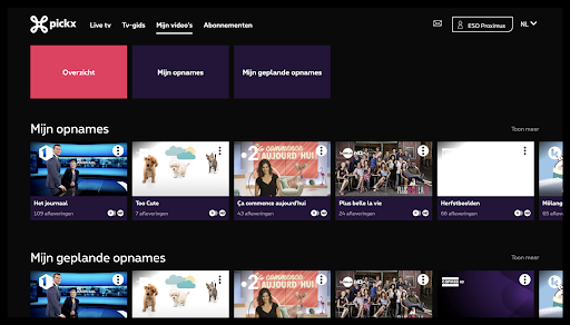
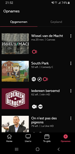
As an example, let’s take a look at the way recordings are shown in the Proximus Pickx app. On the website, as well as in the TV apps, we use rows (or swimlanes as it is called in this context) to show the recordings that are available and planned. For the mobile version, we decided to go for a list view instead of swimlanes. Swimlanes on phones only show 1-2 items at a time, which is great for suggesting people new content without overloading them with too many things at once (e.g. on a Home screen). But for recordings, this is not ideal. Users already know what they have recorded and instead of browsing for interesting content, they are looking for a specific recording when they enter this screen. So here we serve the user better if we show them more items at once. So that’s why we chose to go with a vertical list of recordings for smartphones, as this list is a lot more scannable and will help users find what they need quicker.
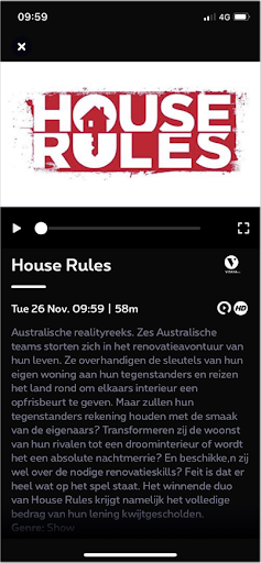
Another example is the detail page for a program. For web, we use a separate video player, but on smartphones, we follow the common pattern for video player apps on mobile: a player within the detail page. Users expect video to play in detail if they tap on it, instead of immediately opening a full-screen player. This means they can still read the description, while the video playback already started.

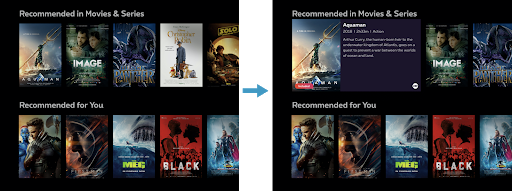
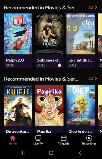
In the Proximus Pickx app design for TV, we show the title and description of movies when an item is in focus. But when we wanted to translate this design to a mobile design, we ran into the problem that there is no such thing as focusing on touch screens. Therefore we chose to show the title and release year below each poster. We decided the release year was important as some movies with the same title can be distinguished by it (this was also validated with user feedback). And in order not to clutter the screen any further, we decided that this was sufficient information for an overview screen.
Key take-aways
So to summarize the learnings that we wanted to share with you:
Take the user’s context into account (of course) 😏
Work around hardware restrictions 🚧
It’s not just the screen, also the way to navigate it is different 👀
TV is not made for data entry
Think outside the linear TV box 🤩
Don’t break platform specific guidelines just for the sake of alignment 👯♀️

