Looking to fly to your favorite travel destination? How exciting! However, depending on the airline, booking your flight can be quite a hassle. At icapps, we're passionate about providing great user experiences and traveling, so UX designer Lucas analyzed the user flow for booking flights with some popular airlines. Lucas recently booked a flight with Brussels Airlines and encountered a few issues. He documented his frustrating experience, but by the time he returned, the airline had already made some changes. We applaud Brussels Airlines for updating their process, but there are still areas that could use improvement.
Let's take a closer look.
The booking process: before
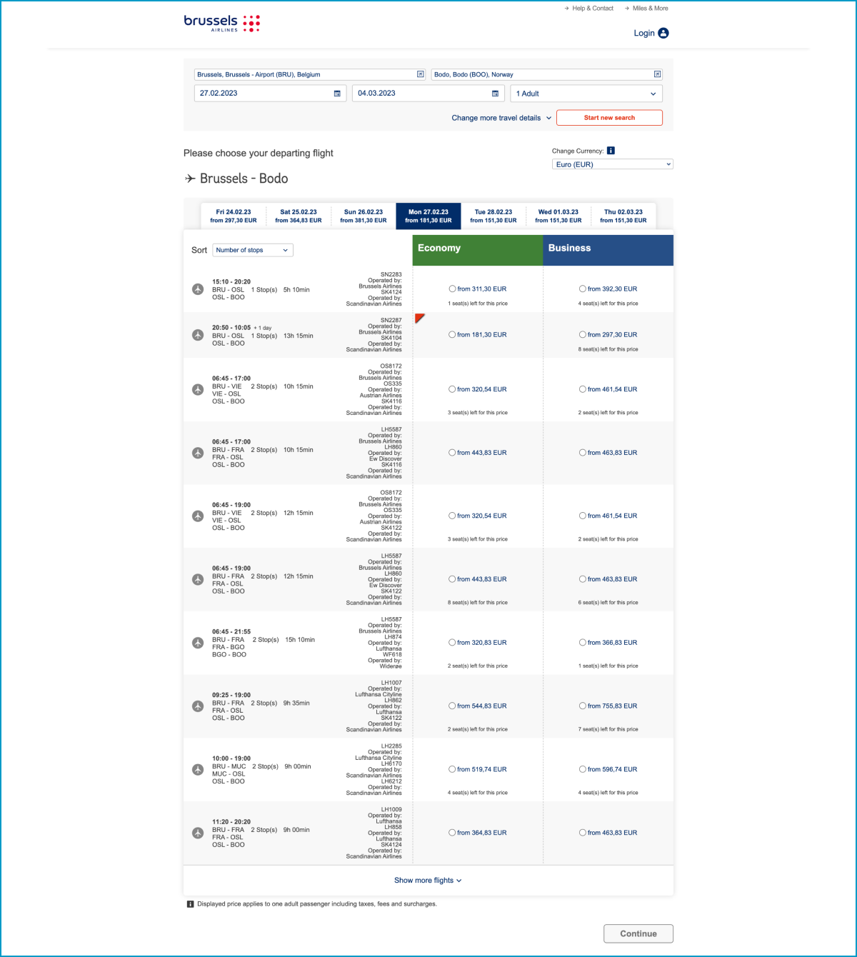
There’s a lack of hierarchy in the design and it’s very hard to scan or read the overview page of all flight options.
Here’s why:
- It seems like everything has the same level of importance because all text elements are styled in a similar way.
- At the bottom of the page, there’s a small notice “Displayed price applies to one adult passenger including taxes, fees, and surcharges.” This is something I would expect on top of the page. Another way to clarify this would be to add “per person” behind every price tag.
- It’s unclear what’s the difference between Economy and Business classes.
- The lowest fare is marked with a red triangle. Red is mostly used to indicate something bad.
So we would advise using green and adding the label “Lowest fare”.
At different points during the booking process, extra information and explanation are missing.
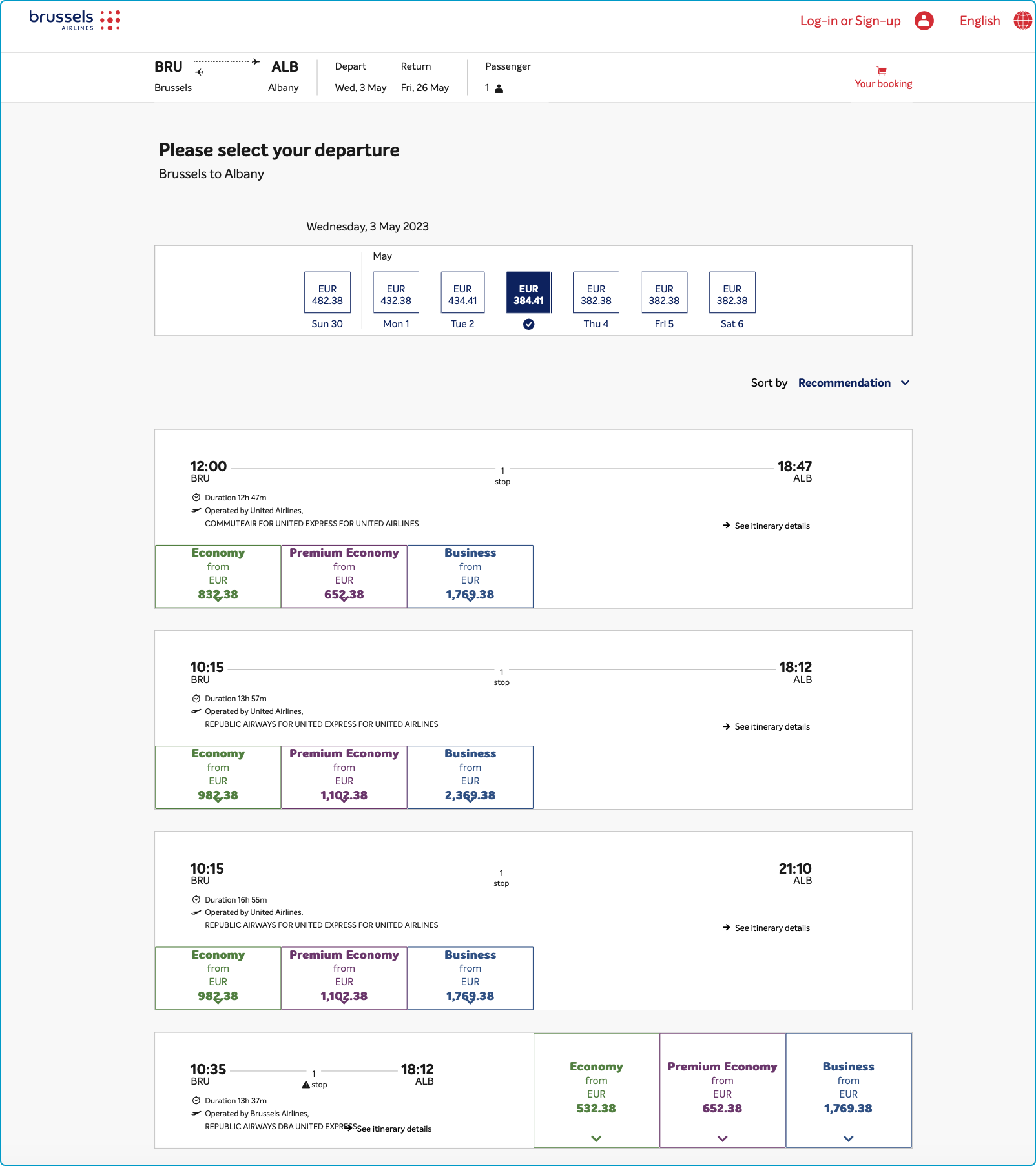
Let's see how they improved!
- At the top, you'll find a helpful summary of your search. Tip: It would be useful to have a progress bar indicating the number of steps and which step you're currently on.
- Sorting has been added, which is great, but the highlighting for the "cheapest fare" has been removed. This could be improved.
- You can now open both categories (Economy and Business) to compare fares and gather more information. However, it's important to note that comparing fares between the two categories requires remembering information from screen to screen. A clear comparison on the same screen could enhance user experience.
- A clear fare comparison is provided, allowing you to quickly see the difference between prices.
- The flight overview is now much clearer, with a well-organized hierarchy of information.
Choose your seat; Before and After
Unfortunately, the difference between the seats is still not clear.
Before
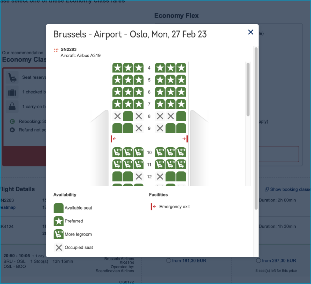
In the previous seat selection process, there was no information at all about the seating possibilities. What is a preferred seat for example? So you blindly had to pick your spot, depending on your preference to be in the front or the back of the airplane, a window, middle or aisle seat.
After
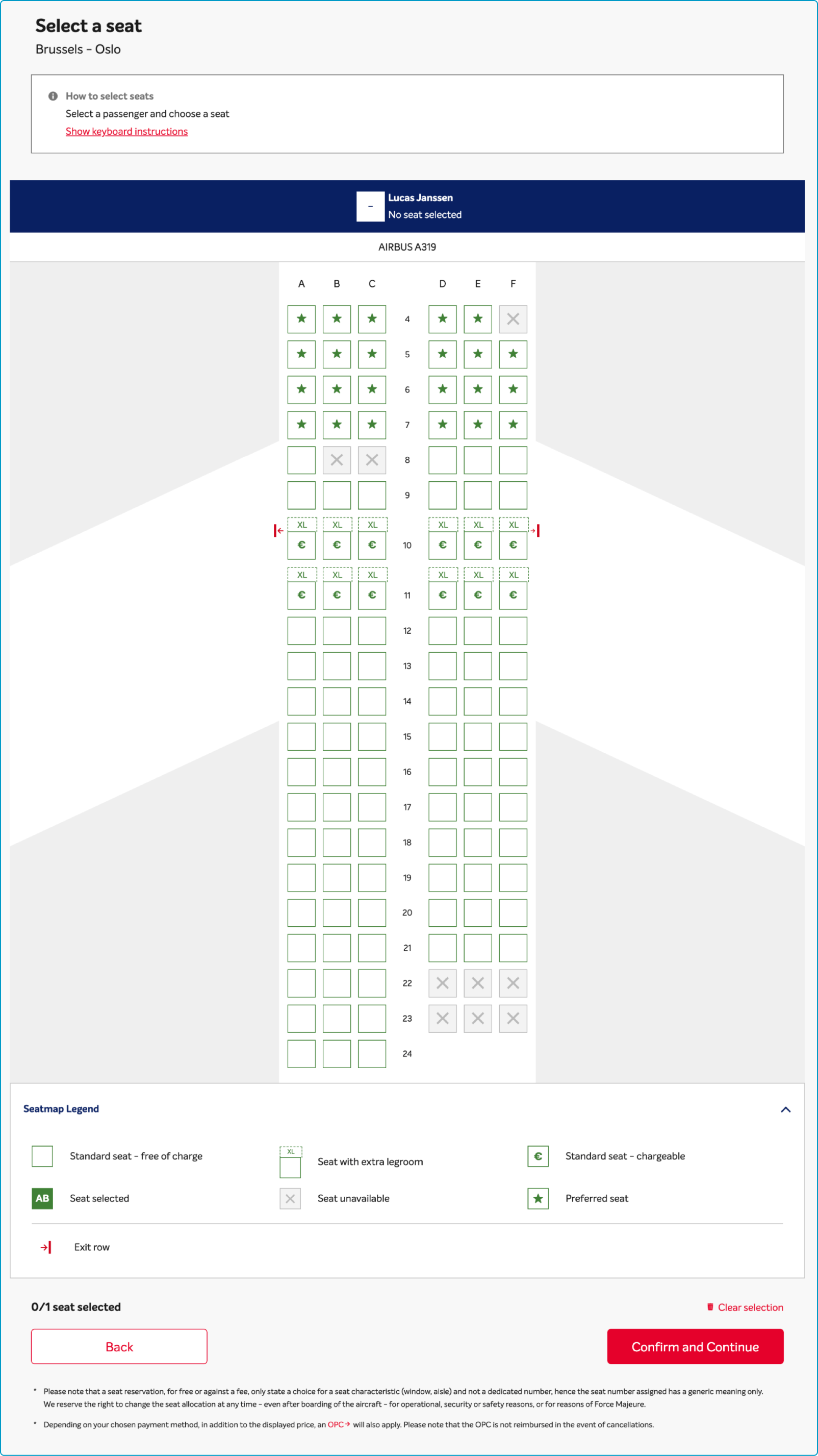
As you can see, Brussels Airlines improved its seating overview but still, there are a lot of things unclear. We still don’t know what a “preferred seat” is, and what’s the difference with a "chargeable seat"?
When you click on a seat, you get additional information in an overlay, but it still doesn’t give you the information you need. And actually, it's only a matter of applying better text.
For example, a "preferred seat" seems like a type of "premium seat". Consider changing the name and making it clear in the overlay why exactly it's a preferred/premium seat. This is also unclear for a chargeable seat.
So, with a little more explanation, we would come a long way!
The old user flow
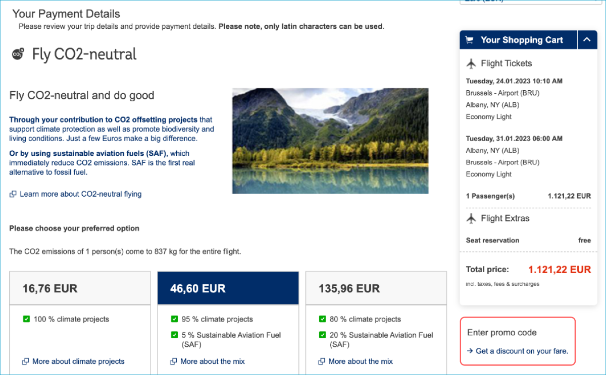
When we look at the old user flow of Brussels Airlines we see that there are multiple steps put together on one page. We could see:
- A summary of your flight information is in the right corner.
- An option to fly more sustainably. It's unclear whether it is an option or not.
- The discount option is located in the bottom right corner, which might not be immediately noticeable to most users.
Playing hide and seek with the discount code
This placement could be perceived as a dark pattern designed to deceive users into spending more money. To prevent confusion and encourage transparency, we recommend prominently displaying the discount option at the top of the payment section.
The new user flow
This flow has significantly improved. Let's see how!
- You now have a clear overview of your flight, including the time, date, and class.
- In the new process, selecting seats or offsetting your CO2 emissions is an optional service rather than a mandatory one.
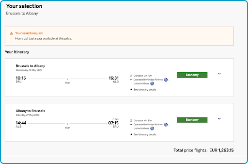
But unfortunately, we see that Brussels Airlines made it even harder to enter a discount code. So if you have one, good luck. We couldn’t find any place to enter a discount. Only when you go to checkout and payment, you can choose the option to pay with a voucher. Does this include a discount code? Who will tell?
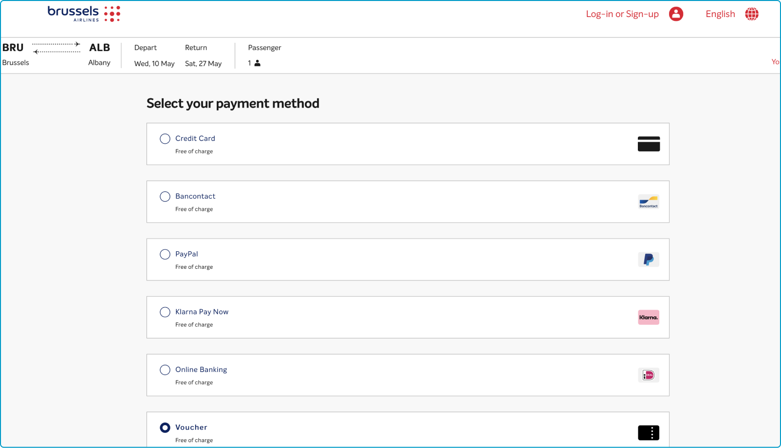
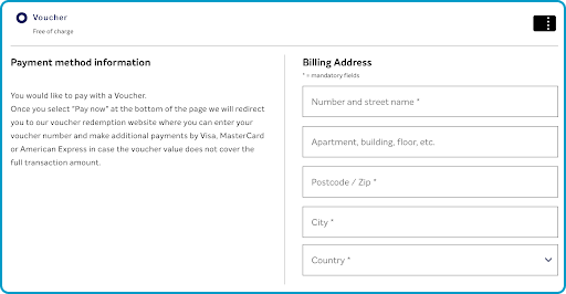
As you can see, when we choose to add a voucher, again, we need to fill in our billing details instead of a voucher code. Weird, right? After this, we have to click on “pay now” but we have no idea what the voucher will do at this point. What we do know is that we will be redirected to a different website where, in case the voucher doesn’t cover all costs, we can pay the remaining price with fewer payment options than in the original payment section (only credit cards).
Brussels Airlines has done a great job updating its booking process.
However, there are still some areas for improvement or differences in approach.
This brings us to the sequel where we discuss examples of the most satisfying booking process we encountered.


