When it comes to booking a service or product online, the user experience and interface can make all the difference between a frustrating or satisfying experience. From clear navigation to intuitive design, there are several factors that contribute to a seamless booking process!
In this blog, we will explore the most satisfying flight booking processes we encountered when it comes to UX and UI, and how they can impact the overall user experience.
An outstanding user experience
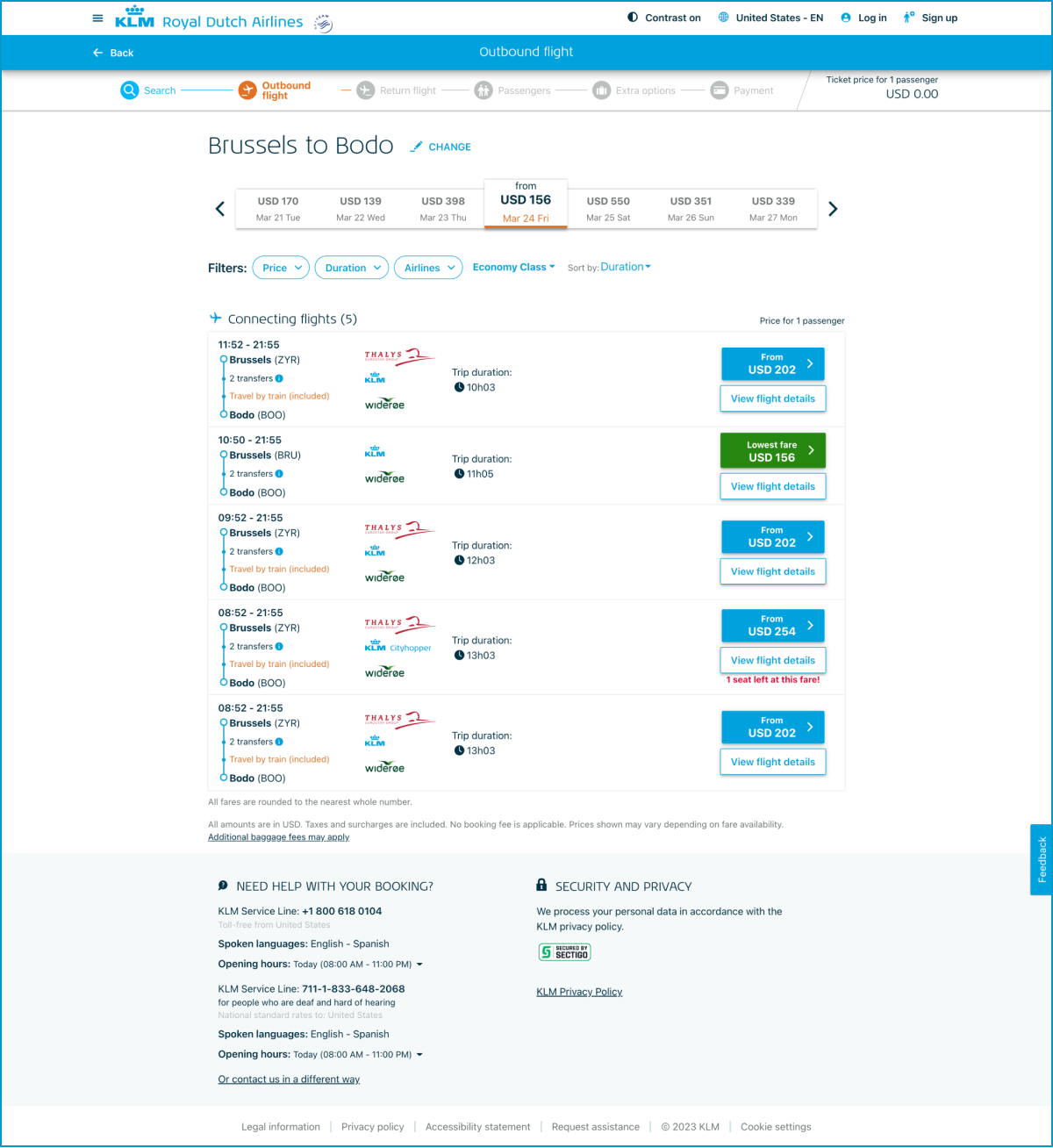
Out of all the air carriers we’ve analyzed, KLM had the best user experience. Let's see why.
- The KLM flight booking page has a progress bar at the top to show users how far they've progressed in the booking process.
- Flights are displayed in a simple hierarchy that is easy to scan.
- Users can access flight details through a secondary button.
- The flight list can be filtered and sorted based on user preferences, such as price, duration, airline, and class.
- KLM provides all the necessary tools to make booking a flight simple and efficient.
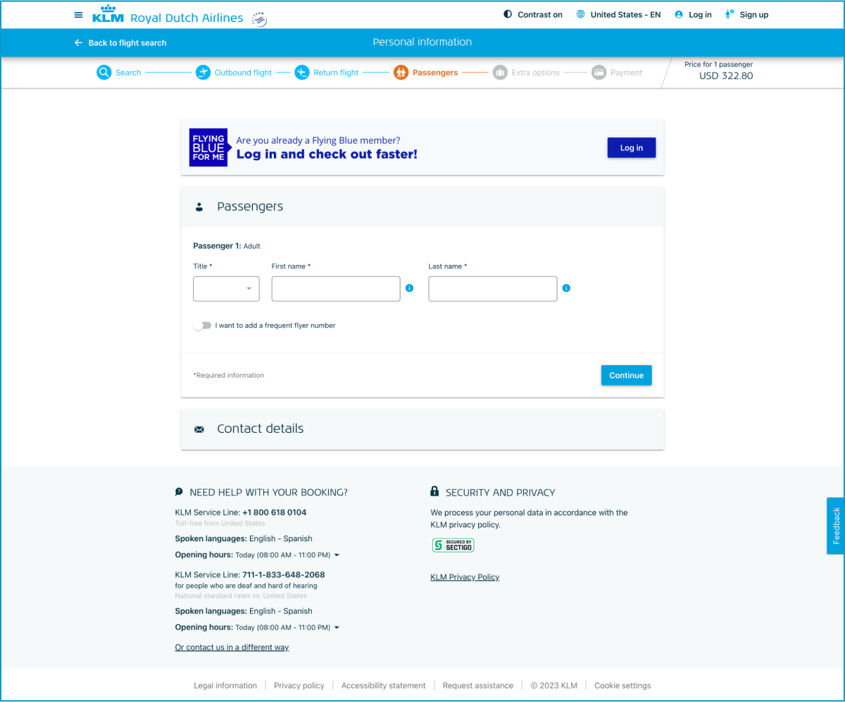
Breaking down long forms into smaller, more manageable sections is a common practice in user experience design. By doing so, users are less likely to feel overwhelmed and may be more likely to complete the form. Additionally, providing users with the option to log into their member account not only speeds up the checkout process but also improves security by ensuring that sensitive information is not entered repeatedly.
However, it's important to note that giving users the choice to skip logging in can also be beneficial as it allows for greater flexibility and reduces friction in the user flow. Overall, these design elements on the KLM website demonstrate a thoughtful consideration of user needs and preferences, which can lead to a positive user experience and increased customer loyalty.
Other steps in the process are all very simple and clear. No dark patterns and unnecessary add-ons are forced on you.
While we've identified some areas for improvement in the user experience of booking flight tickets with popular airlines, we believe that these issues can be addressed with some attention to detail and user-centric design. By taking inspiration from examples like KLM and taking best practices into account, other airlines will be able to take steps to improve their user experience and make the booking process more enjoyable for their customers.
Overall best practices
- Provide a clear progress bar
- Set up a good hierarchy/readability
- Clear pricing patterns that also show options without surplus and what you get for it
- Create a shortcut "login for members"
- Split up long forms
- Provide overlays for extra info instead of entirely new pages
- Clear location selection and comparison, possibility to skip
- Ensure a short and simple flow
Conclusion
We suggest that airlines take inspiration from KLM's approach, which provides a clear overview of fare options and uses intuitive design elements for date pickers and login sections. By prioritizing transparency, clarity, and user-friendliness, airlines can build trust with their customers and ensure that their booking process is a positive experience from start to finish.
We believe that a focus on user-centric design principles will not only improve the booking experience for customers, but also benefit airlines by increasing customer satisfaction, reducing user frustration and confusion, and ultimately driving more bookings and revenue.


